


Written by Mo Kahn on


You've generated a cover image you like, but the title won't sit comfortably over it. Shrink it to a bookstore thumbnail and the illustration becomes a blur. Open the printer's template and there's another problem: you have a front cover, not a spine or back cover.
Book cover vector art works best as a layered publishing asset, not a finished picture you keep enlarging. Use AI to explore imagery, check the front-cover concept at thumbnail size, then build editable typography and vector shapes around it. Keep the printer's specifications beside you from the start, but don't construct the full wrap until the cover communicates clearly.
Extend background artwork beyond the trim, and keep essential text inside it. Those boundaries solve different problems: bleed prevents exposed paper at the edge, while the safety area protects information readers need.
The bleed, color, raster-resolution and hardcover-wrap values below come from IngramSpark's book-cover specifications, which specify 0.125 in (3 mm) bleed, CMYK color, 300 ppi raster elements and a 0.625 in (16 mm) case-laminate wrap. Its title-processing guidance specifies the 1/16 in (2 mm) production variance, 0.25 in (6 mm) text clearance, and spine safety measurements shown below.
Print specifications for vector book covers
| Item | Standard value | Why it matters |
|---|---|---|
| Bleed on all four sides | 0.125 in (3 mm) | Background art must run past the trim to avoid white edges |
| Production variance | 1/16 in (2 mm) | Bleed must absorb trimming shift across all books |
| Text safe margin from trim | 0.25 in (6 mm) | Keeps title, author and logos clear of the cut |
| Spine safe space, spine 0.35 in or wider | 0.0625 in (2 mm) each side | Protects spine lettering from fold and trim |
| Spine safe space, narrower spine | 0.03125 in (1 mm) each side | Narrow spines need tighter margins |
| Raster resolution | 300 ppi at final size | Vector shapes scale, but embedded textures still need adequate resolution |
| Color mode for print | CMYK | Matches the press color workflow |
| Case-laminate hardcover wrap | 0.625 in (16 mm) | Extra wrap is needed to cover the board edges |
| Ebook front cover | RGB pixel artwork, no bleed or spine | Not a print wrap; a separate file is required |
Import the printer's template into Illustrator, Affinity Designer or your layout application. Lock it on a reference layer, then distinguish the trim, bleed and safe-area guides so you can't mistake one for another.
Spine width isn't an artistic choice. Get it from the printer's calculation for your page count, binding and paper stock. Keep decorative elements away from fold-sensitive lettering, especially when the spine is narrow.
A case-laminate hardcover needs artwork that wraps around the boards rather than merely extending beyond a paperback trim. Don't substitute paperback settings, and don't assume a dust jacket uses the same geometry.
Practical rule: Keep the printer's template visible while designing, but exclude it from the exported artwork.
An ebook needs a separate front-cover export, not a cropped screenshot of the print file. Our guide to self-publishing book covers provides useful context for planning those deliverables together. Confirm every value with your chosen printer before export, because bleed, spine construction, color profiles and PDF requirements differ by provider.
A useful AI prompt describes shapes you can rebuild, not just an atmosphere. Start with a clear subject, specify the shape language, limit the palette, and reserve an uncluttered area for typography.
Vector-style output isn't necessarily a vector file. You're asking for a visual direction that will be easier to redraw, recolor and arrange later, not guaranteeing editable paths at generation.
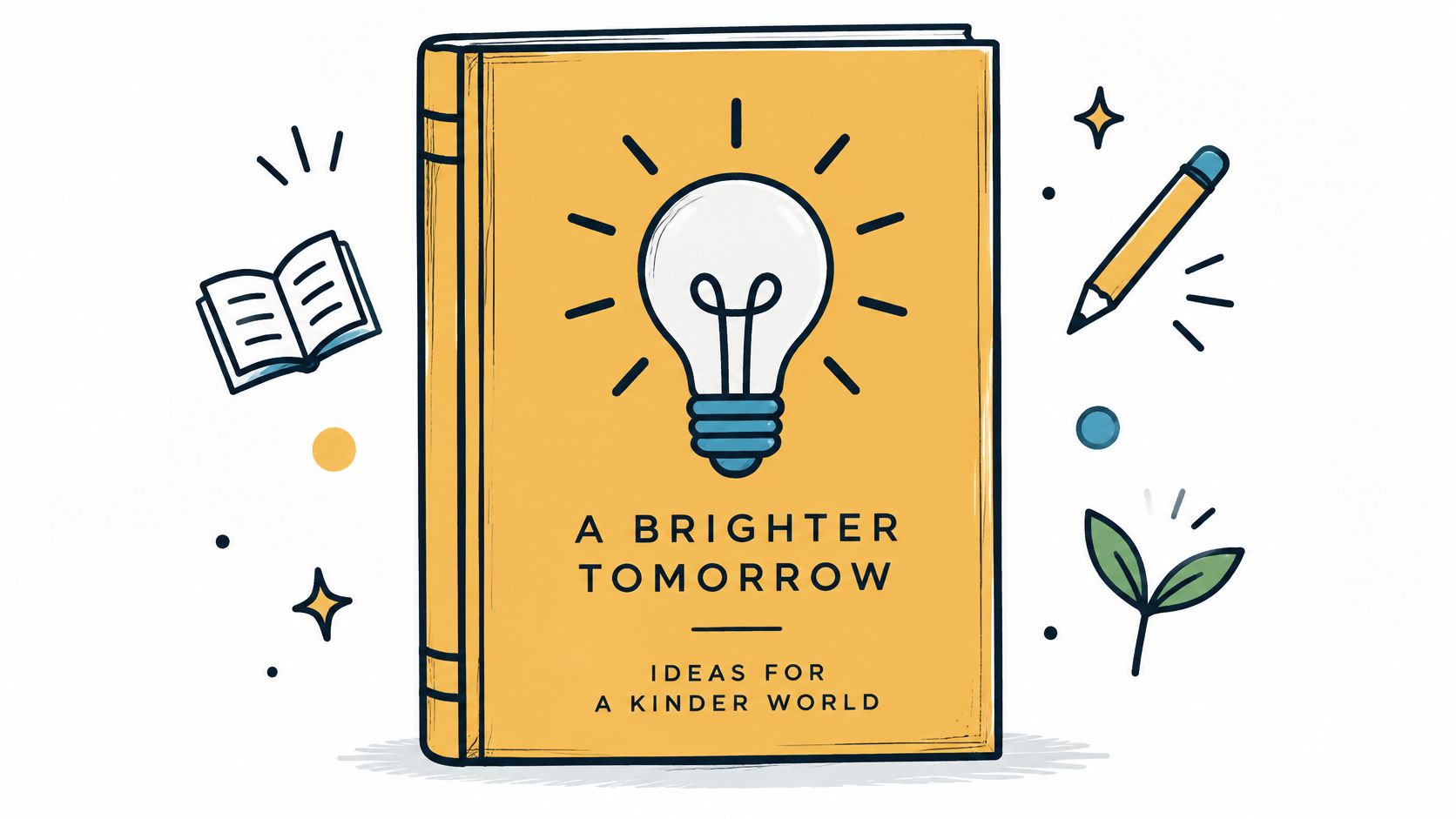
A practical prompt template is:
Subject and pose + shape language + limited palette + composition space + exclusions.
For example: A lighthouse on a rocky cliff, flat vector-style shapes, bold geometric silhouettes, teal and cream palette with charcoal accents, open sky across the upper third for a title added later, no gradients, no text, no lettering, no photographic texture, no busy background.
Keep the subject stable while testing these variations:
The portrait changes the narrative emphasis from place to person. That's a meaningful design decision, not merely a style variation.
Specify no text or lettering because generated words may be distorted or misspelled. Exclude photographic texture when you want clean shapes, and reject busy backgrounds that require you to conceal half the image beneath a title.
Our AI prompt-writing guide can help refine subject and style instructions. If you're also planning an animated cover reveal, revid.ai's guide to AI video prompts is a useful companion for thinking about the moving version separately from the static cover.
Before generating, run this check:
A simpler base usually costs less effort to rebuild. Heavy rendering may look impressive, but tracing its tiny tonal changes produces clutter rather than useful structure.
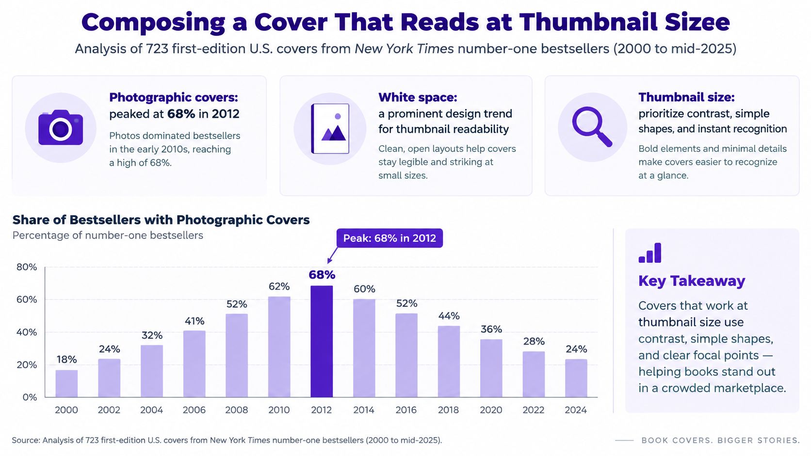
Choose one dominant shape or focal symbol that survives reduction. Put it against a distinct color block, then test genre recognition, title readability, grayscale contrast and a full-size proof before committing to the production layout.
Cover trends support exploring graphic approaches, but they don't prove a particular palette will sell your book. The 99designs analysis of 723 first-edition U.S. covers from New York Times number-one bestsellers, published from 2000 to mid-2025, reports the following shifts, including photographic covers peaking at 68% in 2012.
Bestseller cover color and style shifts
| Color or style | Share of covers |
|---|---|
| Photographic covers | 68% in 2012 (peak) |
| White | 62% in 2020, 79% by 2022 |
| Blue | 37% in 2021, 62% in 2022 |
| Pink | 18% in 2023, a 260% rise from 2021 |
A centered hero symbol on a solid background works when an object can carry the book's central tension. A broken compass, for example, can suggest disorientation without illustrating an entire journey.
Use a horizon split for a setting-led cover. Broad sky and ground areas create natural zones for type, while overlapping foreground shapes supply depth. A tight character crop places more emphasis on identity or emotion, but requires careful separation between the face and title.
Our composition guide helps with those spatial decisions. For a launch that includes campaign graphics, PledgeBox's discussion of visual storytelling for crowdfunding campaigns offers related context for carrying a clear visual message beyond the cover.
The HMD Publishing cover-maker guide recommends staged checks, a full-size proof at 100%, and no more than two coordinated typefaces.
Use one dominant title treatment and a secondary author line. The bestseller sample covers only U.S. number-one titles, so treat its trends as directional context, not a formula for every genre or market.
Build the wrap only after the front-cover concept passes its small-scale checks. Otherwise, you'll spend time aligning a spine and back cover around an illustration that still needs fundamental changes.
The KDP Magic cover-production guide supports this workflow, including 0.125 in (3.175 mm) bleed, an approximately 0.25 in safe margin, and a CMYK PDF with 300 ppi raster assets. It also warns that enlarging artwork created at 72 ppi can't recreate missing detail.
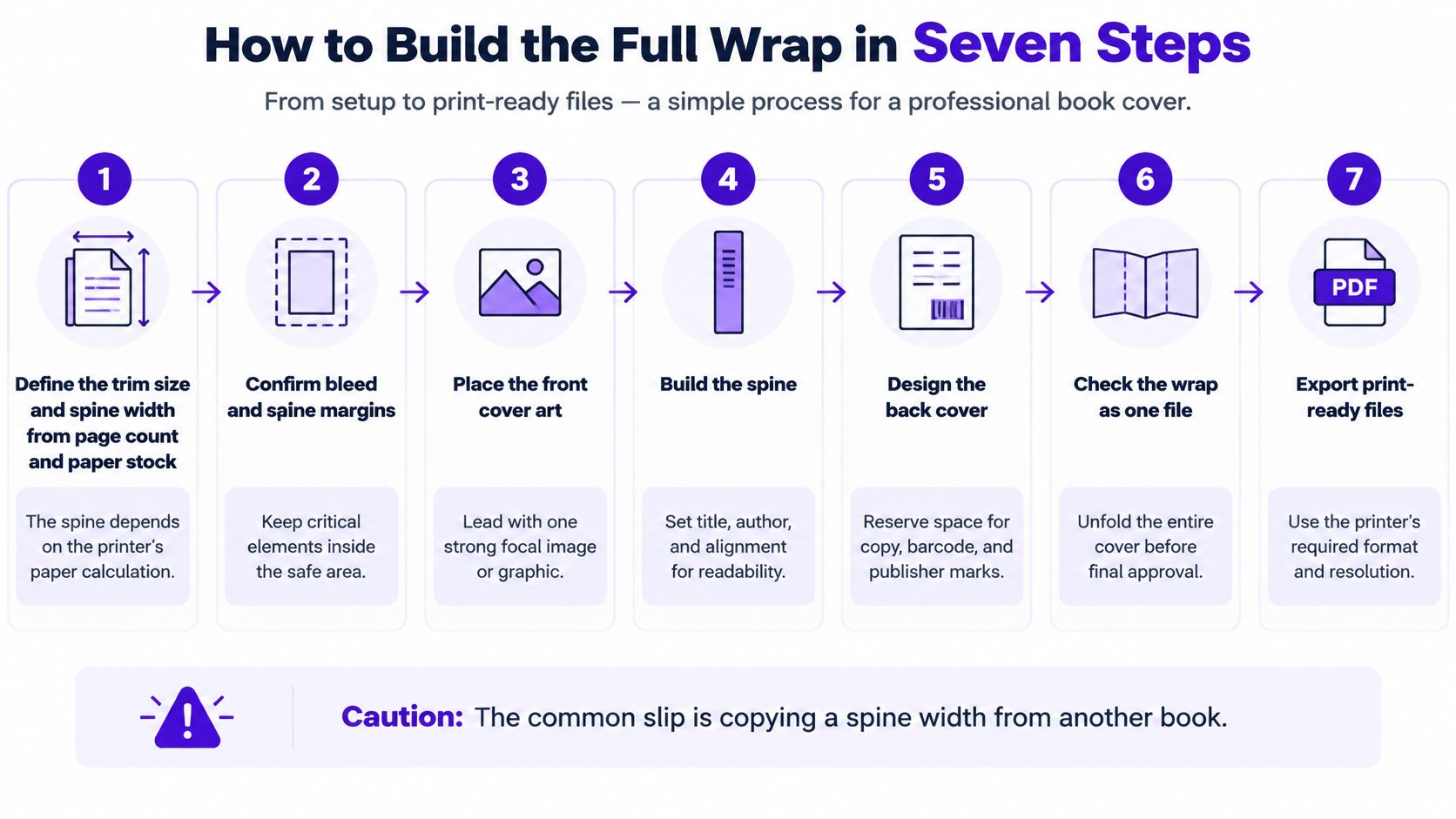
Define the trim size and spine width.
Use the printer's template generated from the final page count and paper stock. Copying a spine from another book is a common slip, even when both books appear to have similar thickness.
Build back cover, spine and front cover on one canvas.
Work across the complete exterior so backgrounds and alignment remain continuous. Reserve a quiet back-cover area for the description, barcode and publisher marks rather than squeezing them into leftover space.
Extend background artwork through the bleed.
Let broad color blocks and illustrations reach the template's outer boundary. A background that stops precisely at trim can expose an unintended white edge when the sheet shifts during finishing.
Keep critical content inside the safe area.
Position the title, author name and logos away from cutting and folding boundaries. A subtitle pushed toward the edge may look dramatic on screen but leave little tolerance in production.
Construct logos, icons and lettering with dependable geometry.
Use vector paths for custom marks and properly embedded fonts for live typography. Preserve a live-text master before outlining any lettering, and don't let a decorative effect flatten the title.
Inspect the assembled wrap at small scale and in grayscale.
Check the front-cover hierarchy again in context, then inspect spine orientation and back-cover spacing. Temporarily hide the template to catch accidental guide lines or reference objects that have entered the artwork.
Export a press-ready PDF.
Choose the printer's accepted PDF/X preset, use its required CMYK profile, and confirm raster assets meet the final-size resolution requirement. Open the exported PDF independently rather than assuming the editor's preview matches the delivered file.
A correct-looking working file isn't the deliverable. Approve the exported PDF and the physical proof.
Before uploading, inspect the PDF's page dimensions, font handling and image quality. Check that the barcode area remains unobstructed, the back-cover copy is final, and no hidden draft text has become visible.
Vector geometry avoids resolution loss; embedded textures don't. A cover can contain perfectly sharp paths alongside an inadequate raster background. Confirm the printer's current specifications before export, and regenerate the template whenever changes to the interior affect the spine.
Start with an editable master, not an export. Keep background, characters, decorative shapes, title, author name and publisher marks on separate layers in Illustrator or Affinity Designer. That separation lets you accommodate a longer translated title or a different edition without dismantling the illustration.
A large image isn't the same as scalable artwork. Enlarging pixels changes their displayed size; editing vector paths changes the geometry used to draw the image.
Place the generated base on a locked template layer. Use the Pen tool to rebuild the dominant silhouettes, then separate overlapping objects into shapes you can move and recolor independently.
Automatic tracing can be useful for rough exploration, but heavily rendered AI images often produce excessive anchor points and small fragments. Simplify each path to the fewest points that preserve the intended silhouette, checking curves at both normal viewing size and close range.
Hide the raster reference to reveal missing shapes or accidental gaps. Delete that reference from the delivery copy once you no longer need it, but preserve the original separately for your process records.
Master-file discipline: Save live text before making outlined delivery versions. Outlines preserve appearance, not convenient wording changes.
Finish the master, export the print PDF, create an SVG where your digital channel supports it, and produce a fixed-size PNG for previews. Don't assume an SVG is accepted by an ebook retailer just because it works on a website.
The W3C's SVG overview describes SVG as XML-based, scalable graphics and explains that drawing instructions need meaningful text alternatives or accessibility semantics to communicate their purpose. Label informative cover assets when the surrounding platform supports it; decorative flourishes can remain decorative.
Which format to use for each channel
| Format | Keeps vector shapes | Best use | Watch for |
|---|---|---|---|
| Editable master (Illustrator, Affinity) | Yes | Revisions and future editions | Save live text and layers |
| PDF/X for print | Yes, if paths stay vector | Printer upload in CMYK | Raster assets must be 300 ppi and bleed must be set |
| SVG | Yes | Web thumbnails and scalable logos | Label meaningful text for assistive technology |
| EPS | Yes | Legacy print workflows | Confirm the printer still accepts it |
| PNG | No | Fixed-size preview | Cannot be scaled up without losing detail |
Keep the limitations beside the format choice. An SVG can still contain an embedded raster image, and a PDF can contain flattened lettering, so the file extension alone doesn't prove the cover is genuinely scalable.
Name exports by edition and destination rather than repeatedly overwriting a file called “final.” Preserve the master independently from upload-ready copies.
A cover can look polished in the editor and still fail in its actual display context. Diagnose what the reader can't see or read before changing effects, brushes or export presets.
If the title disappears in a thumbnail, don't immediately enlarge every element. Remove competing detail, inspect the letterforms, and decide whether the title or illustration should dominate. Enlarging both usually leaves you with less space and the same hierarchy problem.
Vector cover symptoms, causes and fixes
| Symptom | Likely cause | Fix |
|---|---|---|
| Title vanishes at thumbnail size | Thin strokes or too many typefaces | Use one dominant title treatment and no more than two typefaces |
| Muddy cover in grayscale | Contrast depends only on hue | Add luminance contrast between title and background |
| Blurry title after enlarging | Designed at 72 ppi or lettering rasterized | Rebuild lettering as vector and export raster elements at 300 ppi |
| Garbled letters in the art | Lettering generated by AI | Type the title by hand in a vector editor with an embedded font |
Grayscale muddiness needs a brightness adjustment, not a different hue. A saturated title over an equally bright background may look colorful while remaining difficult to distinguish. Try a darker title, a lighter background panel, or a quieter area behind the words.
For blurred lettering, inspect the actual object rather than the filename. A title pasted into an SVG as a bitmap remains a bitmap. Replace it with live typography or deliberately drawn paths, and use the production step list to check the resolution and export settings for any remaining raster content.
Generated lettering deserves a clean replacement, not a sharpening filter. Remove the false letters from the base image, rebuild the background behind them, and typeset the correct title on its own layer.
Check the thumbnail first, grayscale second, and production boundaries last. Solve communication problems before spending time on finishing details.
Prompts alone don't establish human authorship. The U.S. Copyright Office's January 2025 report says prompts don't provide sufficient human control, while protection may apply to perceptible human expression, creative selection or arrangement, and sufficiently creative modifications. Applicants should disclose AI-generated material and describe their human contribution when registering.
That distinction matters more than how elaborate the generated illustration looks. A simpler cover with independently created typography and composition may contain more protectable human expression than a heavily generated image with only incidental cleanup. Editing isn't an automatic guarantee of copyright protection.
A path traced around generated imagery isn't automatically evidence of sufficient creativity. Keep records of the choices you made, such as a newly drawn silhouette, custom lettering or a substantially reworked arrangement, without overstating what those records establish.
For the next concept, use starryai for base imagery: describe your idea, pick a style, select a canvas size for the intended platform, and click Generate. We support exporting and downloading images and storyboards in multiple formats; build the final title and vector structure in your editor, then create the printer-specific and digital deliverables before registration.
Visit starryai to generate base imagery for your next book-cover concept from a description, chosen style and suitable canvas size. Choose a direction that reads clearly as a thumbnail, then turn it into an editable cover system with your own typography, vector shapes and documented creative decisions.


