

Scritto daMo Kahnil


Hai generato una splendida immagine IA, l'hai caricata nella tua community e l'hai vista trasformarsi in un quadrato sfocato che nessuno riesce a leggere. Il problema di solito non è il generatore. È il divario traopere d'arte ad alta risoluzionee una risorsa di reazione che deve comunicare attraverso un'interfaccia minuscola, sfondi mutevoli, compressione, limiti di file e permessi specifici della piattaforma.
Per creare emoji personalizzate che le persone usano, tratta l'opera d'arte come un sistema visivo piuttosto che come un'illustrazione in miniatura. Inizia con un concetto audace, genera una base pulita, rimuovi le distrazioni, testala alle dimensioni di visualizzazione ed esportala per la destinazione più restrittiva che prevedi di supportare.
Un'immagine IA rifinita può sembrare convincente su una grande tela, per poi diventare illeggibile come minuscola risorsa di reazione. Capelli fini, scritte, texture decorative, gradienti morbidi e sfondi collassano insieme durante la riduzione. A128 pixel, un volto o un oggetto può perdere la forma che lo rendeva espressivo in primo luogo.
Le emoji personalizzate hanno bisogno di unasilhouette chiara, un punto focale e un'emozione che sopravviva al ridimensionamento. Un sopracciglio sollevato, una bocca aperta, un pollice in alto, un fulmine o una lacrima esagerata di solito comunicano più velocemente di un viso accuratamente ombreggiato con diversi indizi sottili. La compressione della piattaforma e il cambiamento degli sfondi dell'interfaccia rendono queste scelte più importanti.
Regola pratica:Se il soggetto non è riconoscibile a colpo d'occhio, semplifica l'opera d'arte prima di rifinirla.
Le emoji fungono già da scorciatoie visive nelle comunità online. Un'analisi accademica del 2016 sull'uso delle emoji su Twitter (fonte) ha trovato emoji in19,6% di tutti i tweete37,6% dei tweet degli utenti, con cifre regionali del46,5% in Indonesia, 34,6% nelle Filippine, 37,6% in Paraguaye33,5% in Algeria. I risultati descrivono l'uso ordinario delle emoji anziché i caricamenti personalizzati, ma mostrano perché le reazioni compatte si adattano alle conversazioni della community.
Crea un forte contorno esterno e separa il soggetto dallo sfondo. Un contorno scuro può preservare la visibilità su interfacce chiare, mentre un bordo chiaro o un'ombra contenuta possono aiutare in modalità scura. Le delicate differenze di colore non sono affidabili perché la compressione e i temi delle app possono far apparire identiche le tonalità vicine.
Centra la composizione e lascia spazio intorno al soggetto. Unupscaler di immagini IApuò rendere un file sorgente più pesante, ma una maggiore risoluzione non chiarirà una silhouette ambigua. Testare l'asset alle sue dimensioni di visualizzazione effettive, quindi regolare occhi, bocca, mani o l'oggetto principale finché la reazione risulta leggibile senza testo.
Il divario tecnico è facile da sottovalutare: la generazione produce un'immagine bellissima, mentre il deployment richiede un simbolo leggibile che sopravviva a regole di piattaforma frammentate. Valuta la versione piccola prima di esportare quella grande.
Il prompt più efficace inizia descrivendo l'asset come unicona, non come una scena. Richiedi un unico soggetto centrato, una composizione isolata e uno stile basato su forme forti. L'obiettivo è ridurre la quantità di pulizia necessaria dopo la generazione.
Una struttura utile è:
single centered subject, expressive [emotion or action], flat vector art, simple shape language, thick outline, high contrast, isolated on transparent or plain background, no text, no extra objects, emoji icon
Per un personaggio, sostituisci il soggetto e l'emozione:
centered cartoon cat making an exaggerated shocked expression, flat vector art, thick dark outline, bold eyes, simple colors, isolated emoji icon, no background, no text
Per una reazione basata su un oggetto, rendi l'azione inequivocabile:
single steaming coffee cup with an exaggerated nervous shake, flat design, thick outline, limited color palette, centered composition, clean emoji asset, no scenery, no lettering
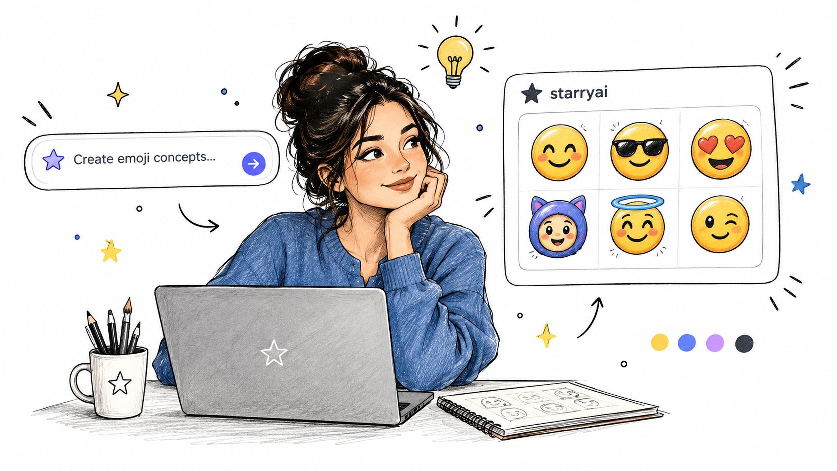
Parole come“vector art,” “flat design,” “thick outlines,” “bold silhouette,”e“isolated subject”spingono il modello verso un punto di partenza più pulito. Le istruzioni negative come “no background,” “no small details,” “no text,” e “no multiple characters” riducono i comuni modi di fallimento, sebbene tu debba comunque ispezionare ogni risultato.
Esagera l'emozione. Un volto leggermente divertito spesso diventa illeggibile se rimpicciolito, mentre un ampio ghigno, occhi sovradimensionati, guance arrossate o una drammatica goccia di sudore rimangono leggibili. Genera diverse variazioni della stessa idea e confrontale a piccole dimensioni, non solo nell'anteprima a piena risoluzione.
Se stai costruendo un set più ampio per merchandising o prodotti per creator, può essere utileconsultare i dati di stampa su richiesta dell'IAper un contesto visivo e di prodotto più ampio. Il flusso di lavoro è diverso dal design delle emoji, ma rafforza la stessa utile abitudine: scegli un linguaggio visivo ripetibile prima di produrre molti asset.
Per un'iterazione più strutturata, laguida al prompt engineering di starryaiè utile quando è necessario controllare la posizione del soggetto, lo stile e le esclusioni in modo più coerente.
Un pacchetto di emoji utile di solito dà un'impressione di intenzionalità. Mantieni lo stile delle linee, lo stile degli occhi, il comportamento dei colori e il livello di esagerazione coerenti in tutto il set. Mescolare un ritratto morbido dipinto con un personaggio in stile adesivo piatto può far sembrare la collezione assemblata piuttosto che progettata.
Evita di chiedere parole leggibili all'interno dell'immagine. Il testo spesso si distorce e le etichette minuscole raramente sopravvivono alla visualizzazione alle dimensioni della chat. Se la reazione dipende da una frase, crea invece l'espressione come indizio visivo, quindi usa l'alias della piattaforma o il messaggio circostante per il significato.
Un'bellissima immagine generata dall'IA può comunque fallire come asset di reazione. Alle dimensioni della chat, una scena affollata diventa rumore, i dettagli sottili scompaiono e un bordo tagliato male sembra un adesivo incollato sull'interfaccia. Tratta la generazione come punto di partenza, quindi perfeziona il file per garantirne la leggibilità sia sui temi chiari che su quelli scuri.
Inizia isolando il primo piano. Uno sfondo trasparente funziona su un numero di interfacce maggiore rispetto a uno colorato, ma la rimozione dello sfondo può danneggiare capelli, pelliccia, fumo, effetti traslucidi e aree racchiuse. Ispeziona il bordo sia su uno sfondo temporaneo chiaro che scuro. Rimuovi scenari, forme vaghe, dita accidentali, caratteristiche del viso duplicate e decorazioni che collassano quando vengono ridotte.
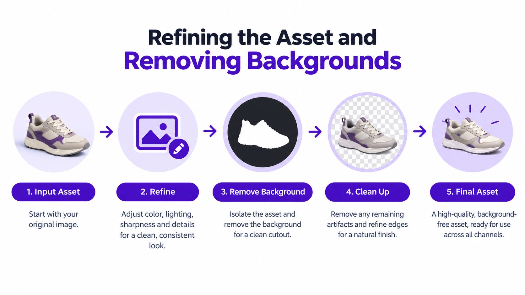
Ritaglia la composizione.Centra il soggetto e rimuovi i margini in eccesso, mantenendo qualsiasi gesto o contorno che trasporti la reazione.
Rimuovi lo sfondo.Usa un appositorimuovi sfondi per creare opere d'arte emoji trasparenti, quindi controlla i fori all'interno di lettere, braccia, maniglie e altre aree racchiuse.
Ripara la silhouette.Chiudi gli spazi vuoti, rimuovi i pixel di frangia e semplifica i dettagli che diventano irregolari alle piccole dimensioni. Un contorno pulito di solito comunica meglio di una texture generata.
Regola contrasto e saturazione.Aumenta la separazione tra il soggetto e il suo bordo senza spingere i colori in artefatti al neon. Se l'asset svanisce su uno sfondo grigio, avrà difficoltà in una chat affollata.
Testa entrambi i temi.Posiziona l'emoji su sfondo bianco, carbone e di tonalità media. Un bordo chiaro può proteggere opere d'arte luminose in modalità scura, mentre un contorno scuro può preservare la definizione in modalità chiara.
La guida alla produzione della Missouri LS Fellowship (guida al flusso di lavoro) descrive il lavoro sulle emoji personalizzate come fasi che copronoconcetto, design, preparazione tecnica, invio e promozione, con allocazioni tipiche di1–3 ore per il concetto, 2–6 ore per il design, 1–2 ore per la preparazione tecnica e 2–4 ore per l'invio. Questi intervalli sono linee guida di pianificazione, non un requisito fisso. Indicano comunque un vincolo pratico: la preparazione tecnica richiede un passaggio dedicato. Affrettarla può causare fallimenti nel caricamento e farti tornare a un'opera d'arte quasi finita.
Esporta un master pulito, quindi crea copie pronte per la piattaforma. Mantieni la sorgente modificabile in modo da poter cambiare contorno, espressione o ritaglio in seguito. I vettoriali aiutano a preservare i bordi taglienti, mentre le esportazioni raster mostrano come la compressione influisca sul caricamento effettivo.
Giudica l'esportazione più piccola accanto a un messaggio di chat reale, non solo nell'anteprima a grandezza naturale. Chiedi: Cos'è? Quale emozione esprime? Un membro della community lo riconoscerebbe senza spiegazioni? Se una qualsiasi risposta è incerta, semplifica la silhouette o l'espressione invece di aggiungere decorazioni. Un'immagine di reazione ha successo quando il suo significato sopravvive al divario tecnico tra una generazione impressionante e un display minuscolo limitato dalla piattaforma.
Un singolo export raramente si adatta perfettamente a ogni piattaforma. L'approccio universale più sicuro è lavorare da un master quadrato trasparente, esportare prima un PNG statico e comprimere una copia per soddisfare il requisito di dimensione del file più rigido. Mantieni il soggetto abbastanza grande da essere letto, ma non fare affidamento su una singola piattaforma per ridimensionare o ottimizzare correttamente la risorsa.
Google Chat offre una specifica relativamente ampia. Il suo endpoint per le emoji personalizzate accetta unimmagine quadrata tra 64 e 500 pixel, inferiore a256 KB, in formatoPNG, JPG o GIF(requisiti di Google Chat). Slack è più restrittivo, mentre Discord aggiunge regole di denominazione e autorizzazione.
| Piattaforma | Dimensione Massima File | Dimensioni | Formati Consentiti |
|---|---|---|---|
| Slack | Meno di 128 KB | Quadrata | JPG, PNG, GIF |
| Discord | Meno di 256 KB | La piattaforma accetta caricamenti ridimensionati, 128 × 128 è un obiettivo pratico | PNG, JPG, GIF, WEBP, AVIF |
| Google Chat | Meno di 256 KB | Quadrata, 64–500 pixel | PNG, JPG, GIF |
Il limite inferiore di Slack lo rende un obiettivo utile per le risorse statiche. Esporta in PNG quando la trasparenza e i bordi definiti sono importanti, quindi rimuovi i metadati non necessari e riduci la tavolozza se il file risulta ancora troppo grande. Il formato JPG può ridurre le dimensioni per le grafiche opache, ma introduce artefatti di compressione attorno ai contorni e gli sfondi trasparenti non sono disponibili.
Il formato GIF è appropriato solo quando il movimento aggiunge significato. L'animazione può aumentare rapidamente la dimensione del file e Slack consente emoji GIF confino a 50 fotogrammi (regole per le emoji personalizzate di Slack). Per un pacchetto di reazioni, il PNG statico di solito offre bordi più puliti, test più semplici e una maggiore portabilità.
Usa nomi brevi e descrittivi. Discord richiede nomi di almeno2 caratteri, con soli caratteri alfanumerici e trattini bassi (requisiti di denominazione di Discord). Nomi comeparty_panicocoffee_yessono più facili da ricordare rispetto a stringhe casuali e alias coerenti aiutano i membri della community a scoprire il pacchetto.
Non hai bisogno dell'approvazione Unicode per rendere significativa un'emoji personalizzata. La reazione di un server privato, un'icona di approvazione specifica per un team, il volto ricorrente di uno streamer o il segnale di assistenza clienti di un brand possono comunicare in modo più efficace all'interno della propria community rispetto a un simbolo progettato per un uso universale.
La distinzione è importante perchéle risorse di emoji personalizzateele emoji Unicode ufficialirisolvono problemi diversi. Le linee guida di Unicode descrivono proposte formali che richiedono prove di un uso ampio e cross-platform, utilità linguistica, distinzione visiva e assenza di ridondanza (FAQ su emoji e dingbat di Unicode). Questo è un processo di standardizzazione, non un normale flusso di lavoro di caricamento.
La domanda giusta di solito non è "Questo può diventare un'emoji universale?" Ma piuttosto "Questo aiuterà questa community a reagire più velocemente e con più personalità?"
Una risorsa della community può fare riferimento a una battuta interna, a un evento ricorrente, alla frase tormentone di un creator o a un momento specifico di un prodotto. Il suo valore deriva dal contesto. Un simbolo universale deve avere senso per le persone ovunque, mentre un'emoji privata può essere intenzionalmente ristretta e rimanere comunque indispensabile per il gruppo che la utilizza.
Usa un'emoji nativa della piattaformaquando la risorsa deve funzionare come reazione rapida all'interno di un singolo server o spazio di lavoro. Scegli unstickerquando hai bisogno di un'illustrazione più grande, di più testo o di una composizione che non può sopravvivere su un display piccolo. Costruisci una risorsa di brand riutilizzabile quando desideri personaggi, colori ed espressioni coerenti su diversi canali.
Questa decisione evita una comune perdita di tempo. I creatori spesso rifiniscono un'illustrazione dettagliata, per poi costringerla in uno spazio per emoji in cui il design non ha spazio per respirare. Una risorsa più piccola e audace può svolgere il compito di comunicazione previsto meglio di un'immagine tecnicamente impressionante.
L'iterazione rapida favorisce anche il lavoro di comunità. Puoi testare alcune espressioni, rimuovere quelle che nessuno usa ed espandere il set attorno a pattern di conversazione reali. Questo ciclo di feedback è più pratico per la maggior parte dei creatori rispetto al perseguire la standardizzazione di un simbolo che deve funzionare su ogni piattaforma e pubblico.
Un'immagine IA rifinita può comunque fallire come risorsa di reazione minuscola. Gli errori di caricamento derivano solitamente da una mancata corrispondenza tra il file e la destinazione. Controlla la tela, la dimensione del file, il formato, la trasparenza, il nome e i permessi dell'account prima di riprovare.
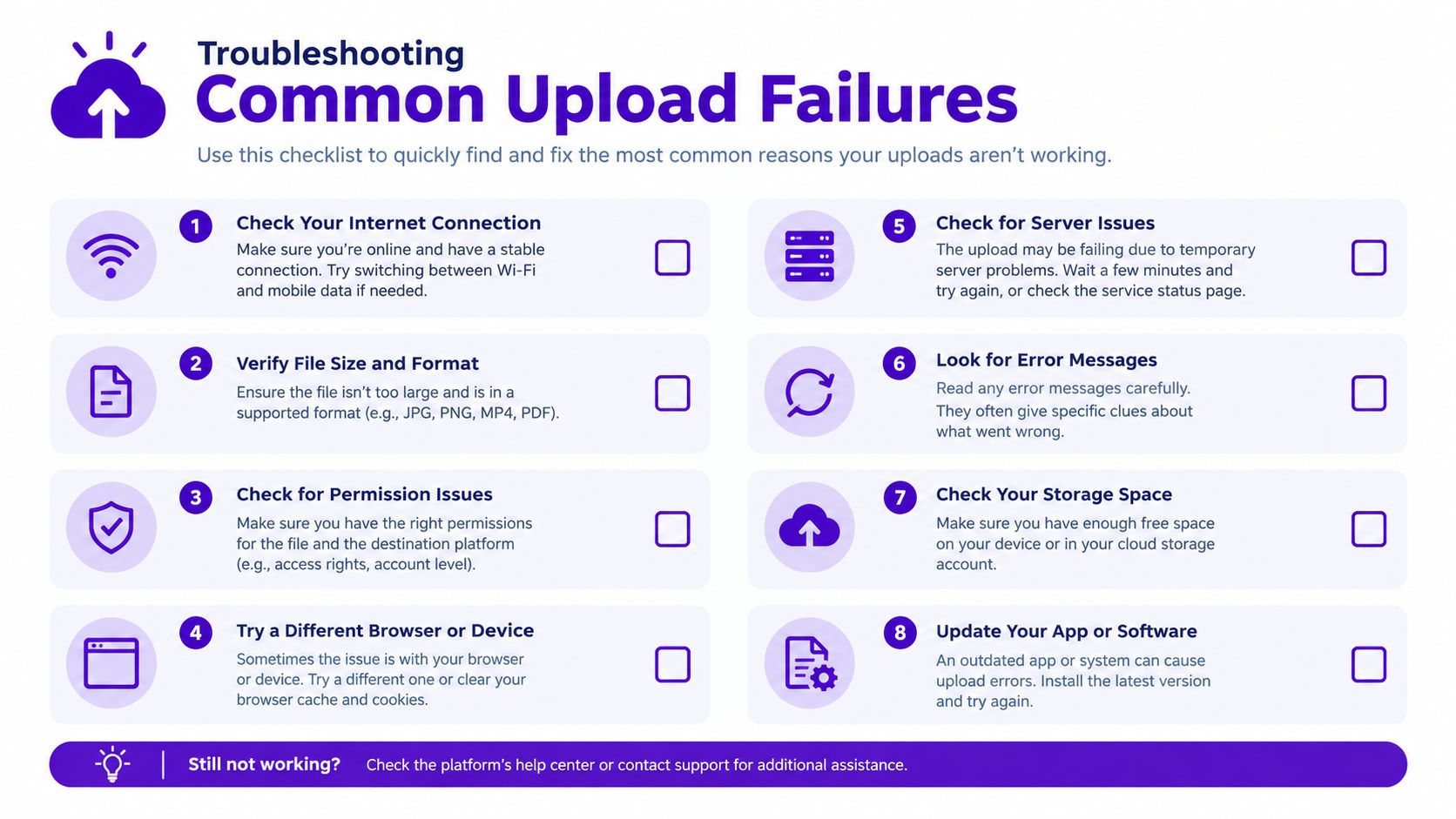
Esegui la checklist prima di ogni caricamento, quindi prova la risorsa in una conversazione reale. L'emoji è pronta quando le persone la riconoscono rapidamente e la vedono chiaramente nella sua interfaccia di destinazione.
Usastarryaiper generare variazioni di concetto, perfezionare la silhouette, rimuovere lo sfondo e preparare un PNG per i test alle dimensioni reali della chat.


.svg)