

Written by Mo Kahn on


You've generated a striking cover image, but when you shrink it to the size of a retailer thumbnail, the details blur together and the title nearly disappears. That's the moment many AI-made covers stop working: the full-size art looks impressive, yet a reader scrolling through Amazon, Kobo, or Goodreads can't quickly tell what kind of book it is.
To make book cover art that holds up, start with the smallest view, not the prompt. A cover needs to signal genre, give the title a clear place to land, and set an honest expectation for the reading experience. Once those decisions are made, image generation becomes much more useful.
Online, your cover is rarely seen at full size first. It appears as a small image among competing titles, in a social post, or beside a recommendation. At that scale, readers won't inspect intricate scenery or subtle textures. They notice the broad shapes, contrast, title, and whether the design looks like the kind of book they want to read.
A survey of 616 readers reported that 79% considered a cover decisive in a purchase decision, while 78% said they would buy, or might buy, a book they knew nothing about if its cover caught their attention (survey findings on book-cover influence). That doesn't mean artwork works alone. Readers weigh it alongside the subject, description, author reputation, price, and recommendations. The cover earns attention, then the rest of the listing has to support the promise it makes.
Build a quick test into your process. Shrink each concept to a small retailer-style thumbnail and ask:
A detailed image can be beautiful and still fail this test. A simpler silhouette, bolder contrast, or less crowded composition often travels better from a full-size canvas to a storefront tile.
Practical rule: Make the cover legible as a thumbnail before polishing its fine details.
Your image should work with the title and marketing copy, not replace them. A cover that promises a fast-paced thriller but looks gentle and romantic can attract the wrong reader and confuse the right one. Make the visual promise specific, then use the title and description to reinforce it.
If you're building concepts from visual references, an image-to-prompt product can help translate an example image into prompt language. Use that kind of tool to describe composition or lighting, not to copy another author's recognizable cover.
A cover makes a quiet promise: this book belongs on the shelf a reader expects. Before generating images, study the visual language of your category. Browse current covers in the relevant Amazon and Apple Books listings, then note repeated choices in palette, typography, focal point, and imagery. The aim isn't to clone a bestseller. It's to learn which signals readers already recognize.
A 2019 computer-vision study examined 207,572 Amazon book covers and found relationships between genre, font style, and color. Decorative fonts were especially associated with recreational books, showing that typography can function as a genre signal, not just a stylistic flourish (study of genre patterns in book-cover design).
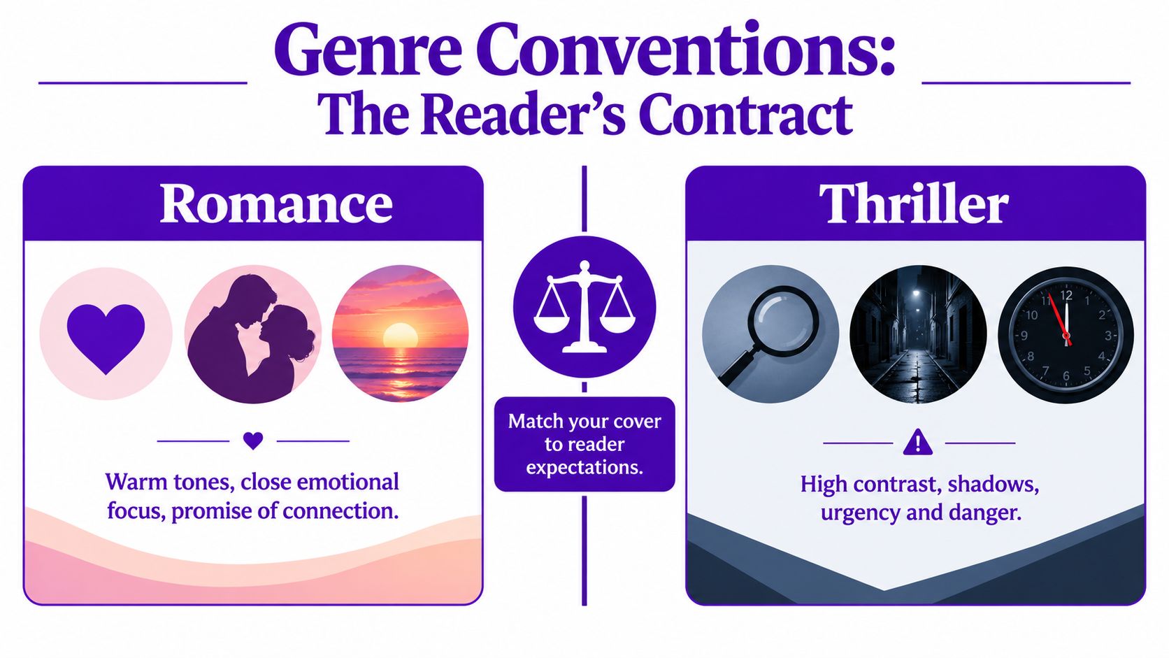
Collect 8 to 12 covers from your category and arrange them together. Don't just save the ones you like. Look for recurring decisions:
Pick two or three cues that recur across your references. Then choose one controlled difference, such as an unusual accent color or a more minimal focal image. Too many departures from category conventions can make a cover feel misplaced; too few can make it blend into the shelf.
Write a short description before you open an image generator. Name the genre, the mood, the focal subject, and the visual cues you want to retain. Then state what you want to do differently. For example: “A tense psychological thriller with one isolated figure, cool shadows, a sharp red accent, and a clear open area for the title.” That brief gives you a design target. Without it, prompt revisions can become a string of aesthetic preferences with no shared direction.
A useful image prompt reads like a design brief, not a list of objects. In starryai, specify what the viewer should notice first and where the title needs to sit. If you ask only for a character or setting, the generator may fill the entire frame with detail and leave you no workable space for typography.
Use five components to control the result:
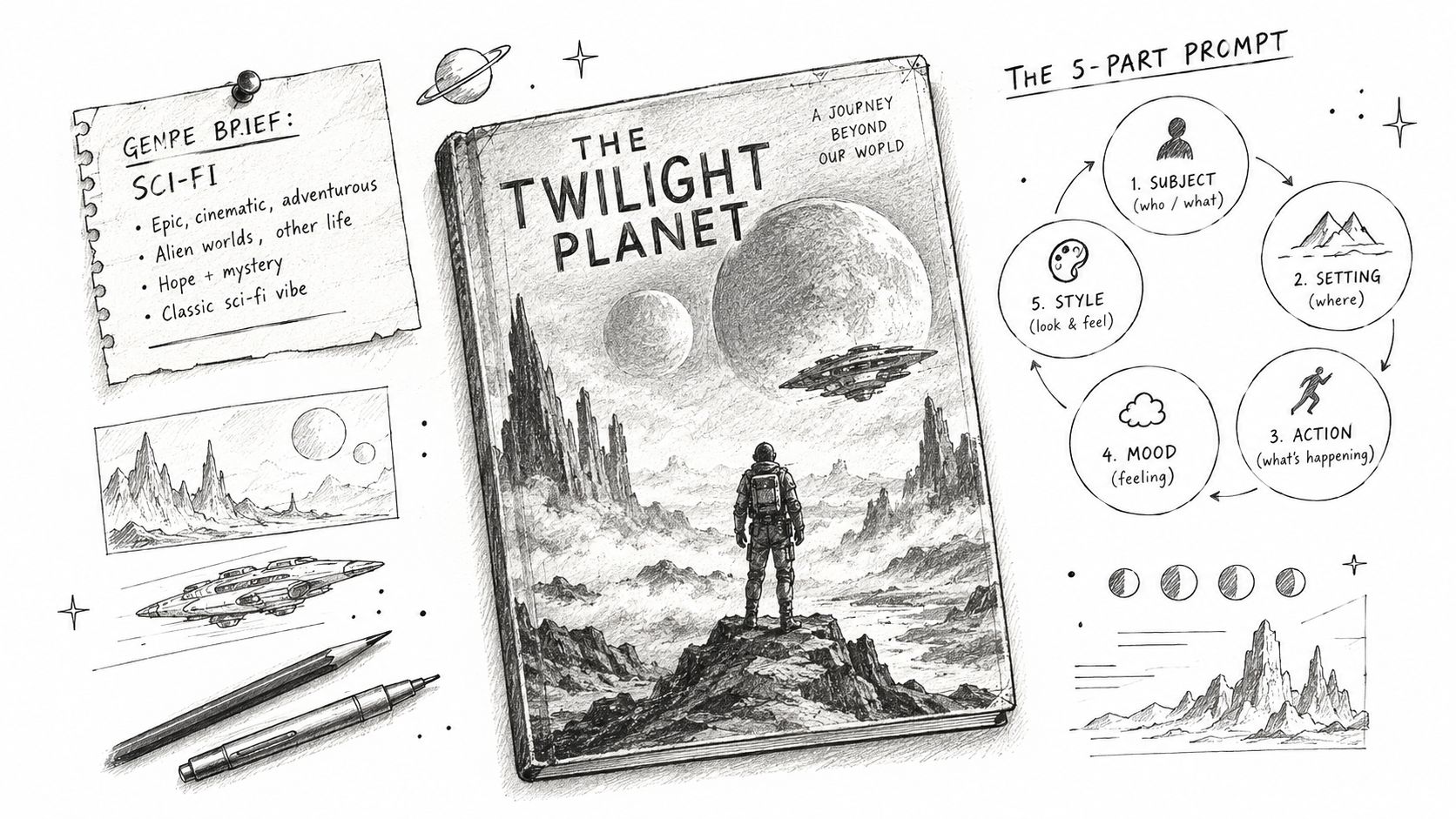
A sample prompt for a science-fiction mystery might read: “A lone astronaut standing before a sealed circular doorway on an abandoned lunar station, quiet dread, one clear central silhouette, restrained charcoal and pale blue palette with a small amber light, cinematic but uncluttered, empty dark space across the upper third for the title, no text, no lettering.”
The phrase “empty dark space” gives the generator a job without asking it to produce a blank cover. If the result fills that area with stars, machinery, or glowing symbols, refine the composition: ask for fewer background details, move the focal subject lower, or request a plain, low-detail region behind the intended title.
Create several different compositions, not near-identical versions. Try a character-led image, a symbolic object, and a setting-led scene. Compare them at thumbnail size. A recognizable silhouette usually matters more there than small facial or costume details, so choose the image whose main shape remains clear when reduced.
For iteration, keep the prompt's core brief stable and change one major choice at a time. If every reroll changes subject, palette, and mood, you won't know which decision improved the cover. A guide to visual composition can help you think through balance and focal placement; if you're comparing generators, you can also find budget-friendly AI art tools before settling on a workflow.
Use this loop: prompt, shrink, inspect, refine, select. If a concept still fails at small size after a focused revision, move on rather than polishing an image that doesn't communicate.
AI-generated lettering is a production trap. It can look plausible at a glance, but misspellings, uneven spacing, and inconsistent letter shapes make it unreliable for a finished cover. Generate the artwork without text, then add the title, author name, and any supporting copy as live type in a layout application.
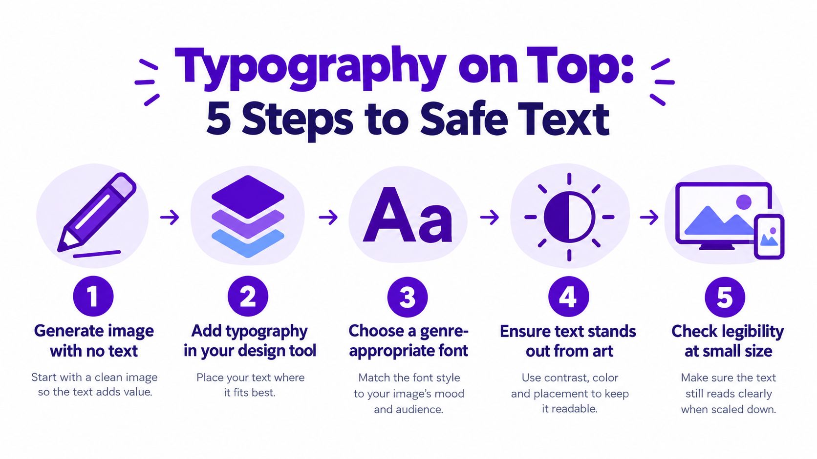
Import the chosen image into a layout tool and position the title in the quiet area you reserved when writing the prompt. Keep the title's contrast strong against its background. If a focal object crosses the text area, reposition the text or use a restrained overlay behind it rather than adding outlines and effects until the lettering becomes cluttered.
Choose typefaces that suit the category and remain easy to read. A bold, condensed face might fit a tense thriller; a more decorative style may suit a romantic or fantastical tone, but should still be readable at a glance. Limit the number of type styles. Use size, weight, and placement to create hierarchy instead of giving every line a different font treatment.
The order should be obvious: title first, author name next, supporting details last. A subtitle or short line of copy shouldn't compete with the book's name. For a series, keep recurring elements consistent across covers, such as the author-name placement or a small visual motif, while letting each installment's artwork stay distinct.
Type should clarify the image, not fight it.
For print, keep essential text clear of the trim danger area. KDP's print guidance specifies a minimum 0.25-inch margin from the bleed line on all four sides, creating a safety zone for titles, author names, and logos (KDP cover margin guidance). Check your layout against the template for the specific format before exporting.
Then inspect the type at small size. Adjust spacing between letters where needed, check that thin strokes don't vanish, and ensure the title remains distinct from nearby shapes. A subtle color overlay can help separate text from a busy image, but it shouldn't become a substitute for choosing a better placement or simplifying the artwork.
A design that looks polished on your monitor can still break down in a store listing or a print proof. Check the cover at reduced size, in grayscale, and for accessibility before you call it finished. Each test exposes a different problem, so don't rely on a single full-size preview.
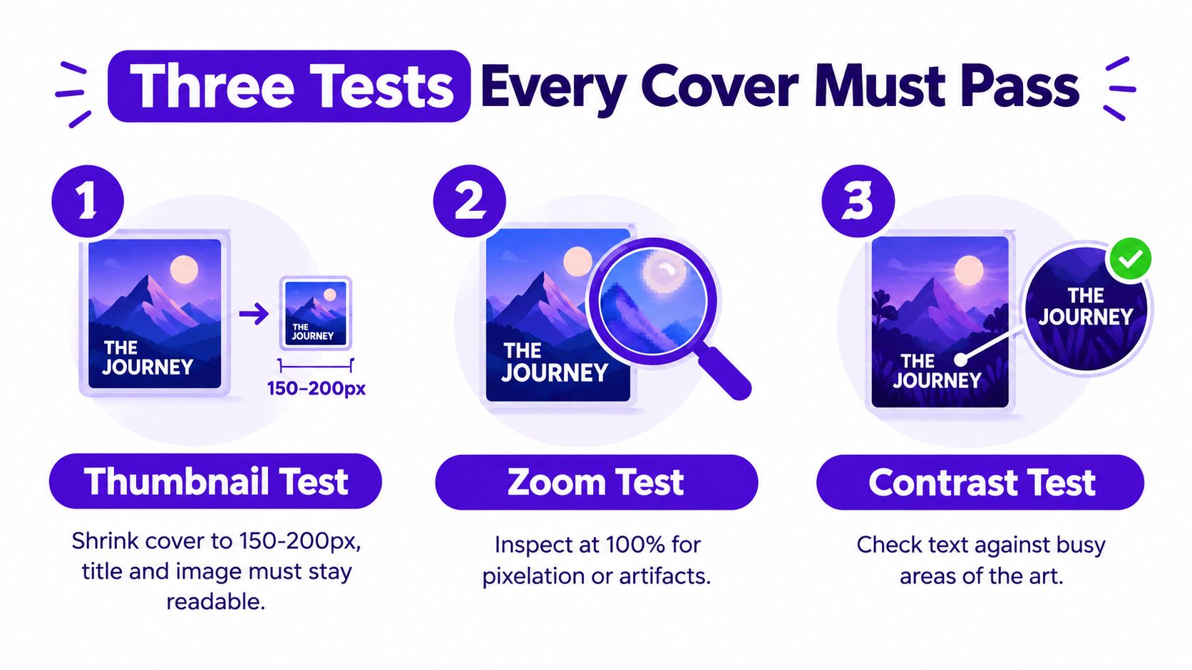
Reduce the cover to a small storefront-style image. Check whether the genre, focal point, and title are still apparent. If the main subject disappears, simplify its silhouette or strengthen the separation between foreground and background. If the title becomes hard to read, increase contrast, choose a heavier type treatment, or move it into clearer space.
This test catches the common mismatch between intricate artwork and the way people encounter books online. Judge the cover at the reduced size, not by how impressive the full-resolution image looks.
Remove the color and check the light-to-dark structure. Does the title still stand out? Can you distinguish the focal subject from the background? If the cover becomes a single gray mass, adjust tonal contrast or simplify the shapes. Color can support a design, but it shouldn't carry every distinction on its own.
Review the title against its background for readable contrast, and avoid putting essential text over high-detail areas. The Australian Publishers Association recommends logical hierarchy, readable contrast, and color-blind-friendly palettes; it also notes that cover descriptions help assistive-technology users take part in discussions about the image (accessibility guidance for book covers). Write concise alt text that describes the cover's meaningful visual elements without repeating the title as if it were an image description.
Finally, inspect the artwork at full size for pixelation and generation artifacts. Check faces, hands, props, and repeated patterns, then confirm that the file's resolution, fonts, and barcode clearance meet the selected platform's requirements.
The video below offers another look at the cover-design process.
The print wrap isn't just a front cover stretched across a canvas. Your trim size, binding, paper stock, and final page count determine the complete dimensions, including the spine. Fix those details first, then generate the correct platform template instead of guessing at the spine width.
Amazon KDP requires paperback covers to include 0.125 inches (3.2 mm) of bleed on all sides. The full width is calculated as bleed plus back-cover width plus spine width plus front-cover width plus bleed (KDP paperback bleed and cover dimensions). Extend background artwork through the bleed, but keep titles and other essential elements inside the template's safety boundaries. For a print-resolution refresher, see this guide to image resolution for printing.
| Requirement | Amazon KDP | IngramSpark |
|---|---|---|
| Template and dimensions | Use the selected trim size and final page count to generate the platform template and determine the wrap and spine. | Use the printer's template and production specifications for the selected format. |
| Bleed and safety | Include the required bleed and keep important text within the safe area. | Follow the template boundaries and allow for the guide's stated manufacturing variance. |
| Fonts and export | Export the complete cover at the exact required dimensions as a print-ready PDF. | Embed fonts in the PDF; the guide allows a 1/16-inch manufacturing variance. |
| Small text | Check legibility and placement against the template. | The guide recommends 100% black for text at 24 pt or below. |
Keep a layered source file with separate artwork, color grading, and typography. Export the ebook front cover separately from the print wrap, using the same approved composition but without the spine and back panel. Before uploading, open the finished PDF at 100% scale, inspect the trim and spine alignment, verify embedded fonts, and confirm the barcode area is clear. A front-only design or incorrect spine width can push text into the hinge or leave visible trimming artifacts.
Use the printer's own current template and PDF rules for each edition. KDP and IngramSpark don't share one universal export setup, so a file that passes one platform's checks may still need adjustment for the other.
Start with a genre brief, generate a few distinct compositions in starryai, and test the strongest option at thumbnail size before you add the type. Once the title reads clearly and the printer template checks out, export the ebook cover and print wrap from the same layered design.


.svg)