

Written by Mo Kahn on


You've got a photo you already like. The pose works, the composition works, but the style is wrong, the light is flat, or the background doesn't match where you want to post it. Starting from a blank prompt means losing the part you wanted to keep.
AI image to image solves that trade directly. You give the model a source image to hold onto and a prompt that describes what should change. Every setting after that is a choice about how much of your original survives and how much the model is allowed to invent.
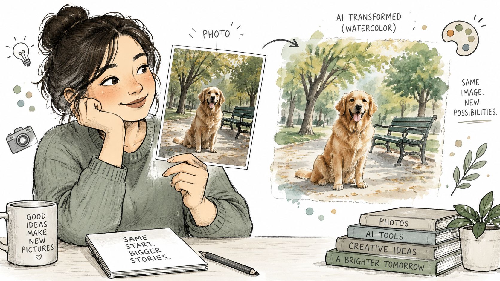
Say you've photographed your dog in a park. You want the same dog, in the same spot, under the same tree, but rendered as a loose watercolour painting. Text-to-image would start from random noise and invent a new dog. AI image to image starts from your photo, so the dog's position and the shape of the scene guide the result from the first step.
Think of it as tracing paper. The outlines and placement stay where you put them while someone repaints the surface underneath. The tracing can be followed closely, so only colour and texture change, or loosely, so the repaint keeps the general layout but redraws details.
You'll meet the same three inputs in almost every tool:
The idea became a formal task with pix2pix, presented at CVPR 2017. It learned mappings between paired examples, such as building labels to facades, maps to aerial photos, and edge drawings to shoes. That turned translation into a learned transformation instead of hand-built graphics work. In the MMagic implementation notes, the official pix2pix result for facades reports an FID of 119.135, one of several paired benchmarks used to judge how close outputs sat to the target images.
Diffusion models later replaced GANs for most consumer quality. Latent diffusion made that practical by working in a compressed representation instead of raw pixels. The Latent Diffusion Models project page reports an FID of 2.95 for latent diffusion on LSUN Bedrooms, compared with 5.11 for the pixel-space comparison, where lower is better.
If you want the contrast in more depth, read how text-to-image AI works before your first edit. For now, sort your goal into one of two groups. You're either restyling an image you already have, or you're creating a finished image from a rough reference. That choice decides which settings deserve your attention.
One control does most of the work. Denoising strength, usually shown as a value from 0 to 1, sets how far your source is dissolved into noise before the prompt rebuilds it. Low values leave the photo almost intact. High values keep only a loose hint of layout and give the prompt far more freedom.
The Hugging Face Diffusers img2img documentation describes the pipeline as encoding the input, adding controlled noise, then denoising under a prompt. The underlying SDEdit approach reportedly exceeded prior GAN-based methods by up to 98.09% on realism and 91.72% on overall satisfaction in human-perception experiments.
| Strength range | What stays | What changes | Typical use |
|---|---|---|---|
| 0.05 to 0.20 | Almost everything, including fine detail | Light cleanup, slight colour and texture shifts | Photo polish and subtle enhancement |
| 0.21 to 0.40 | Face, pose, framing, and main objects | Style begins to show, lighting and surface change | Selfie restyling and product mood changes |
| 0.41 to 0.60 | General composition and subject placement | Clothing, background details, and rendering style | Character variations and stronger illustration looks |
| 0.61 to 0.80 | Broad layout and large shapes | Most details are redrawn from the prompt | Turning sketches or renders into finished scenes |
| 0.81 to 1.00 | A faint suggestion of the original layout | Nearly a new image guided loosely by the source | Concept exploration when fidelity matters least |
The trade-off is plain. More strength buys more change, and it also raises the risk of losing fine detail, text, hands, and facial identity. A selfie that still needs to look like you can't afford the same setting as a rough sketch that only supplies a pose.
That's why presets help. A preserve mode uses low to moderate strength for selfies and product photos. A full transformation mode uses higher strength for character concepts, cover art ideas, and sketches. You're still choosing a number, but you're choosing it by goal first.
Practical rule: Pick the lowest strength that makes the requested change clearly visible. Anything higher usually costs detail without buying you anything useful.
Don't guess from a single result. Generate the same prompt at 0.3, 0.5, and 0.7 and compare them side by side. Look for the point where the change becomes obvious before identity or important details start to slip.
Exact numbers shift between models and interfaces, so treat the bands as a starting map, not a promise. You've found the right setting when three things hold true. The subject is still recognisable, the change reads clearly at phone size, and nothing unrequested has appeared in the frame.
Strength is useful, but it's blunt. It can't tell the model to keep a pose while changing an outfit, or to hold a room layout while replacing every material. It loosens or tightens the whole image at once.
Control methods solve that by extracting one kind of structure from your source and holding it in place. The prompt then works on appearance, such as texture, clothing, lighting, and style, while that chosen structure stays fixed. You're no longer asking for general similarity. You're naming exactly what must not move.
| Control | What it locks | Best for | Watch for |
|---|---|---|---|
| Edge map (Canny) | Outlines and silhouette | Product shapes, logos and line-art characters | Double outlines when the source is noisy |
| Depth map | Distance, room layout and figure placement | Book covers, interiors and scenes with a clear foreground | Flattened output when the depth estimate is inaccurate |
| Pose skeleton | Body position and gesture | Repeatable avatars, RPG characters and athletic poses | Hands and fingers often stay weak |
| Sketch or scribble | The user's own linework | Concept art from hand drawings | Details that were never drawn are ignored |
| Segmentation map | Regions such as sky, clothing or furniture | Recolouring one area while keeping the rest | Needs careful region labelling |
| Surface normals | Surface shape and lighting direction | Relighting product shots | Less common in consumer tools |
The best known system behind this approach is ControlNet. The ControlNet paper describes a trainable conditioning branch attached to a pretrained diffusion model while the original backbone stays locked. The authors report stable training with datasets ranging from fewer than 50,000 images to more than 1 million. In plain terms, the control branch learns to read edges, depth, pose, or another map, while the main model keeps the rendering ability it already had.
Say a game team needs one character in five outfits. A pose control keeps the stance identical across all five, so the set reads as deliberate costume variants instead of five unrelated figures. A book cover works differently. There, a depth control can hold the figure, doorway, and foreground in place while the prompt changes the painting style and light.
Add one control when the layout must hold. Stacking several at once often makes the result stiff, because the model has too little freedom left to render anything naturally.
An upload button makes transformation feel casual. That ease is exactly why you should pause before sending a face, a child's photo, an unpublished character, or a client asset to any service.
Answer four questions first. Is the source image kept? Is it used for model training? Can it be deleted? Who can access or reuse the output? If a platform doesn't answer those clearly, don't upload sensitive material there.
That caution isn't abstract. A 2025 UC Berkeley study of creative professionals found distrust of generative AI platforms leading creators to reduce visibility and change privacy settings. People who make images for a living are already treating uploads as a risk decision.
Ownership needs the same care. The U.S. Copyright Office AI policy guidance states that copyright protects human-authored expression, so material where an AI system determines the expressive elements isn't automatically protected. A larger work can still qualify when it combines AI images with human-authored text, creative arrangement, or substantial human modifications, and applicants must identify the human contributions.
Disclosure rules are tightening too. The EU AI Act Article 50 service desk summary explains that providers must mark synthetic image output in a machine-readable format, and deployers must disclose deepfake content to viewers. This isn't legal advice, and rules differ by place and use. Treat consent, records, and disclosure as part of the creative workflow, not paperwork you add after publishing.
A reliable edit isn't one lucky generation. It's a short sequence where each step protects the next one. Follow the order once, exactly as written, before you start improvising.
The overview below condenses the process into five stages, from choosing the source to exporting the final file.
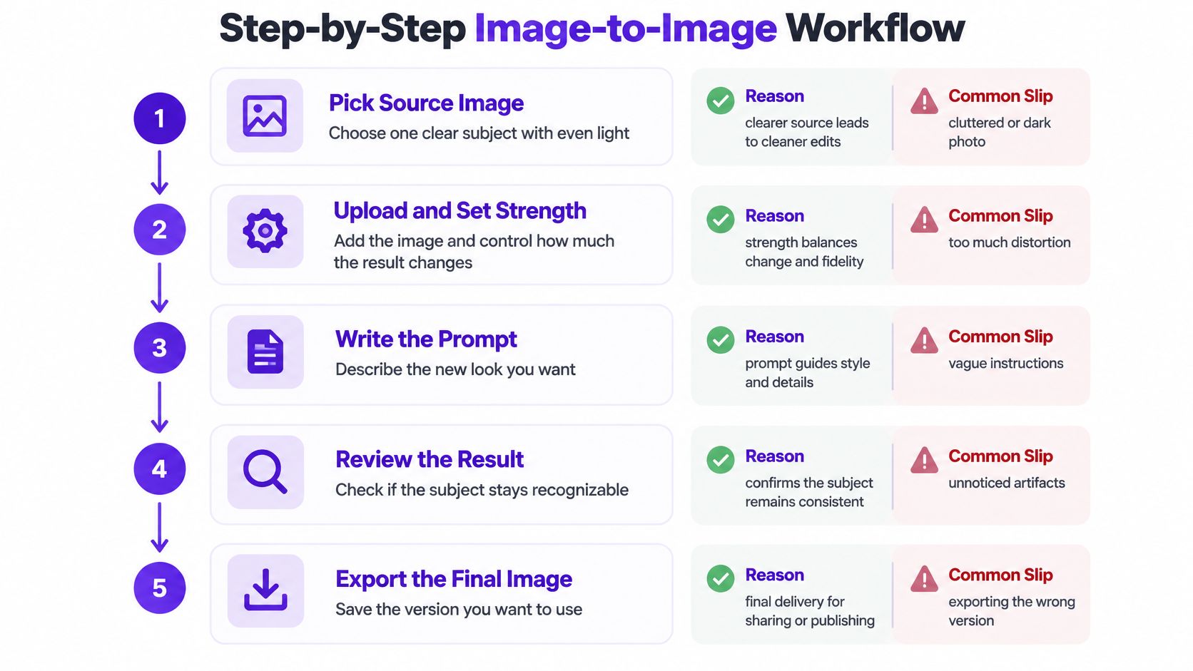
The short walkthrough below shows the same upload, prompt, and review rhythm in motion.
You're finished when the subject reads clearly, the requested change is obvious, and nothing unrequested has appeared. If you have to explain what the image was supposed to become, the edit isn't done yet.
Most disappointing results aren't mysterious. They point back to one setting, one weak source, or one prompt that's asking for the wrong thing. Diagnose the symptom first, then make a single change.
Identity drift causes the most complaints. A face changes shape, age, or expression because strength is too high for a portrait. Lower strength by 0.10 to 0.15, or add a pose or depth control so the head position and proportions have something firmer to follow. This fix often works in one rerun.
The opposite problem looks like the model ignored you. The output is nearly identical to the source, which usually means strength is too low or your prompt describes the subject instead of the change. Raise strength in a small step and rewrite the prompt around style, light, clothing, setting, or material.
Colour failures are subtler. At high strength, the model rebuilds so much that your original palette disappears, and a prompt with few colour terms gives it nothing specific to aim for. Name the palette directly, such as deep teal shadows and warm amber highlights, then reduce strength if the source colours should still lead.
Don't regenerate the whole image to fix one hand. Mask the broken region, lower the risk there, and leave the parts that already work untouched.
| Symptom | Likely cause | Fix |
|---|---|---|
| Face or identity drifts | Strength too high | Lower strength by 0.10 to 0.15 or add a pose or depth control |
| Output ignores the prompt | Strength too low, or prompt describes the subject | Raise strength gradually and rewrite the prompt as the change |
| Colours wash out or turn muddy | High strength with few colour terms | Name the palette in the prompt and lower strength |
| Extra fingers or warped text | Detail limits at high strength | Inpaint that region and lower strength |
| Doubled or haloed outlines | Noisy source or low edge threshold | Clean the source and match the canvas ratio |
| Background bleeds into subject | No region separation | Add a mask or segmentation control |
Doubled outlines usually start before generation. A noisy, compressed, or badly cropped source gives edge detection too much false detail to follow. Clean the source, match the canvas ratio to the original, and rerun before you touch anything else.
Background bleeding needs separation, not more prompt words. Add a mask or segmentation control so the model knows where the subject ends. Strength and prompt fixes often take one run. Hands, text, and region problems usually need several focused passes, and that's normal rather than a sign the whole approach has failed.
Image-to-image earns its place when your source already contains something worth keeping. It preserves a composition you like, speeds up variations on a known layout, holds a character steadier across a set, and restyles existing assets instead of forcing you to reshoot them.
That fits TikTok creators restyling selfies, indie authors testing character looks, Etsy sellers building mockups, RPG players making avatars, and marketers producing on-brand variants. Sellers working with garments can also compare the workflow with specialist ai fashion photography from WearView, where keeping the product recognisable matters more than inventing a new scene from nothing.
The limits are just as consistent. Faces drift at high strength, so protect them with lower settings or a pose control. Small text and logos rarely survive a rebuild, so restore text with a mask and add logos in a final manual pass. Hands and reflective surfaces stay unreliable even when the rest of the image looks convincing.
Use this verdict by situation:
Before you commit an afternoon, generate one variant. Judge whether the kept elements still match the source, then ask whether the remaining fixes take less time than starting from scratch. If the answer's no, change methods early.
Pick one source image you own. A selfie, a product photo, or a rough sketch all work, as long as the subject is clear and you have the right to use it. Write one sentence for the change, such as "watercolour style with warm sunset light," and resist adding a second idea until the first one works.
Run the privacy checklist before you upload anything with a face or a client asset. Then set your starting strength, follow the workflow order, and generate a small set instead of judging the tool by a single output.
For a hands-on test in starryai, upload the photo and describe the change in your own words. Users can upload a photo, and starryai's AI editor turns words into high-quality visuals. To create the image, describe your idea, pick a style, select a canvas size for the platform where you'll share it, and click Generate. Generated images can be downloaded instantly in high resolution or shared directly on social media.
Run the three-strength test on that same photo and keep the lowest value that delivers the change. Pick the best result, check that the subject is still recognisable at phone size, and save the source, prompt, and strength before you publish. That small record turns a lucky output into a repeatable method you can use again.
Upload a photo you already like to starryai, describe the change in one clear sentence, and compare a few strengths until the subject stays recognisable and the new style reads at a glance. You'll get a practical feel for AI image to image far faster by testing one real project than by reading about settings in the abstract.


