

Written by Mo Kahn on
September 27, 2026


You've found the reference image. The lighting is exactly right, the subject has the expression you want, and the composition feels effortless. Then you try to describe it, and the result comes out as a generic portrait with flat light, random colors, and none of the original tension.
That's the core challenge behind image to prompt workflows. A tool can identify a face, a chair, or a sunset, but a useful recreation depends on details such as light direction, lens feel, spatial hierarchy, texture, and visual style. Manual reverse-engineering gives you control over those details, while automated analysis can still speed up the parts humans find tedious.
Every creator eventually saves an image they can't quite explain. It might be a moody portrait with a narrow strip of window light, a product photo with unusually soft shadows, or an editorial composition where empty space makes the subject feel expensive. You know the image works, but “woman at desk, cinematic lighting, high quality” won't capture why.
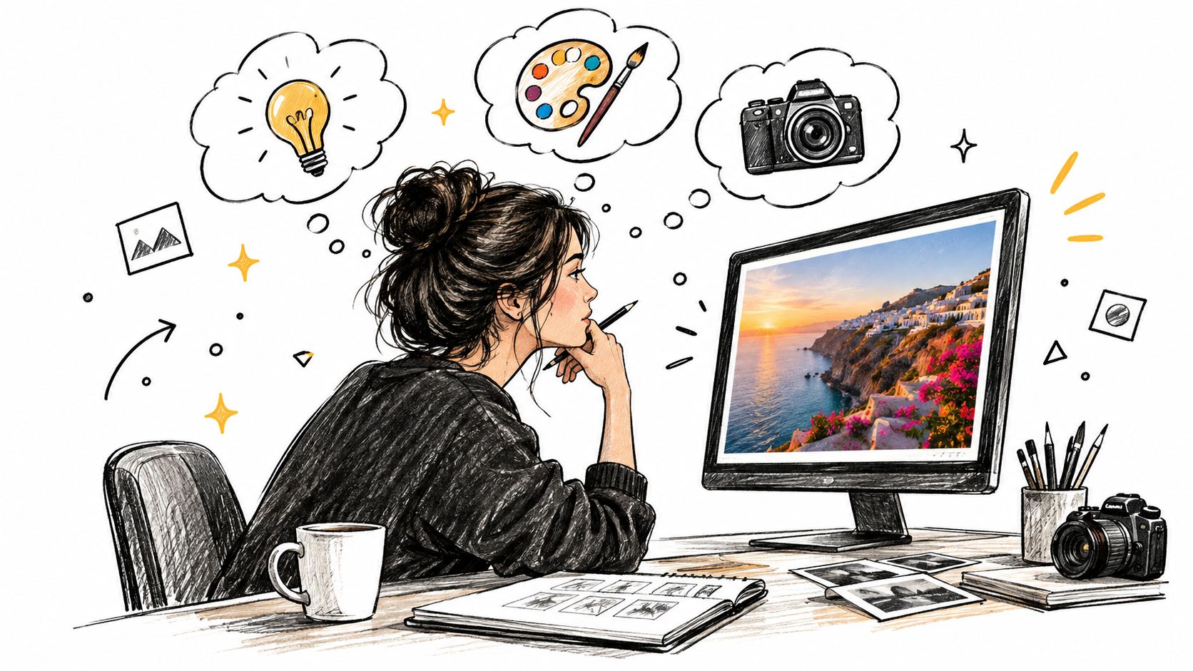
The problem is that image descriptions usually begin with objects instead of relationships. A caption might identify a person, desk, notebook, and lamp. It may miss that the person sits off-center, the lamp creates a warm pool against a cooler room, and the desk leads the eye diagonally toward the face. Those omissions matter more than the object list.
Most image-to-prompt systems follow a sensible pattern. A vision-language model analyzes the reference, then an LLM proposes text that could recreate it. One documented approach uses a two-stage process that compares the reference with a generated image before drafting candidate reverse prompts, which makes the workflow more useful than simple captioning alone (the described reverse-prompting approach).
Other pipelines combine BLIP captioning with CLIP similarity search. The system creates a caption, retrieves nearby keywords from a prompt database using image embeddings, and combines those keywords with the caption (a documented CLIPInterrogator-style pipeline). That can surface useful style language, but it can also produce a crowded prompt full of loosely related terms.
Practical rule: Use extraction to generate clues, not to make the creative decision for you.
The broader history explains why these systems became practical. Google's Conceptual Captions dataset, introduced in 2018, contained about 3.3 million training images, alongside 28,000 validation images and 22,500 test images, creating the scale needed for image-text systems to connect visual patterns with language (OpenAI's historical account of DALL·E and image-text learning). OpenAI's DALL·E announcement on January 5, 2021 helped move text-guided image generation from research demonstrations into a mainstream product category.
That scale doesn't eliminate the description gap. It makes automated assistance possible, but the human eye still has to decide which visual facts define the reference. A useful hybrid workflow combines a machine's breadth with a creator's judgment. For context on why images and language work together in the first place, see this guide to multimodal AI.
A strong description doesn't report everything visible. It identifies the details that control the generated image's identity. Start with the subject, but don't stop there. A useful image to prompt translation usually needs four connected layers: lighting, composition, color, and style.
Ask where the light comes from, how large the source appears, and what happens in the shadows. Soft frontal light produces a different face from a small directional source placed high to one side. A hard rim light separates a subject from the background, while ambient overcast light reduces contrast and gives materials a quieter appearance.
Describe the quality rather than reaching immediately for a fashionable adjective. “Warm key light from camera left, cool ambient fill, gentle shadow under the chin” gives a generator more usable direction than “beautiful cinematic lighting.” If the image contains practical lights, windows, or reflections, include them only when they influence the scene.
Composition is the arrangement of visual weight. Note whether the subject is centered, placed on a third, cropped tightly, or surrounded by deliberate negative space. Record the camera angle, apparent distance, horizon position, and depth relationships.
A low angle can make an ordinary object feel monumental. A top-down view turns a table into a graphic pattern. A shallow foreground with a distant background creates a different reading order from a flat, evenly focused scene. These relationships often matter more than listing every object.
Extract the dominant palette first, then identify accents. You might see muted sage, cream, and charcoal with a single orange detail. Or the scene might rely on deep blues, pale skin tones, and amber highlights. Avoid naming colors that are technically present but visually irrelevant.
Color also has a distribution. Ask whether the palette is concentrated in the background, reserved for the subject, or repeated through small accents. A “red jacket” is less informative than “a single saturated red jacket against desaturated gray architecture.”
Style includes medium, era, finish, and cultural reference. Decide whether the image feels like a studio photograph, editorial fashion spread, analog film still, graphic poster, oil painting, 3D render, or hand-drawn concept art. Then describe the surface qualities that support that reading, such as grain, halation, brush texture, glossy reflections, paper fibers, or clean vector edges.
The strongest prompts describe how visual choices work together, not just what appears in the frame.
A practical sequence is subject, action, setting, composition, lighting, color, material, and style. This order keeps the prompt readable and gives the model a hierarchy instead of a pile of disconnected descriptors. For a broader foundation, use this introduction to prompt engineering for beginners.
Manual extraction works best when you delay writing. Look at the image first, reduce it to visual decisions, and only then turn those decisions into language. The aim isn't to describe every pixel. It's to identify the attributes that another image must preserve.
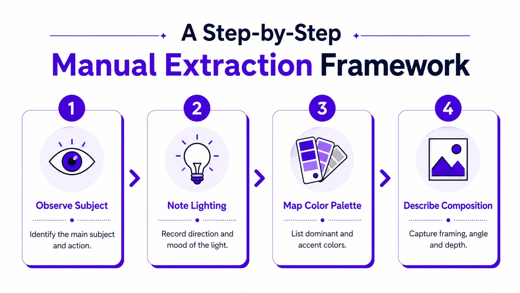
Name the primary subject in concrete terms, then state what it's doing. “Person” is weak. “Young woman leaning over a wooden desk, looking toward a sketchbook” gives you identity, posture, and action.
Separate primary from secondary elements. The focal subject gets the clearest description. Background objects should appear only if they establish place, scale, or mood. A portrait may need the person, pose, clothing, and expression, but not every book on the shelf.
Find the brightest region and trace the direction of the shadows. Is the source overhead, lateral, frontal, backlit, or scattered across the entire scene? Then describe the quality: hard, diffused, hazy, glossy, low contrast, or sharply sculpted.
For a moody portrait, you might record a narrow warm window source from the right, deep falloff on the opposite cheek, and a dark background. For a commercial product shot, you might note broad frontal illumination, controlled reflections, a pale backdrop, and a soft grounding shadow. The same object can feel intimate or commercial depending on this layer.
Write down the dominant background color, the subject's main color, and the strongest accent. Then add material observations. Matte paper, brushed metal, wet glass, knitted wool, skin, polished plastic, and rough concrete each respond to light differently.
Material language helps prevent a prompt from becoming visually generic. “Black bottle” describes an object. “Matte black glass bottle with a restrained highlight and condensation beads” describes how the object should render.
Record framing, angle, crop, and depth. Is it a close-up, medium shot, overhead arrangement, wide scene, or centered product layout? Note whether the subject faces the camera and whether the background is compressed or expansive.
Inspect embedded text separately. Readable lettering, labels, signs, and interface elements need their own pass because image generators may treat them as visual texture rather than language. OCR can help identify the words, but you should still decide whether the text belongs in the final output or should be added later in a design tool.
A compact extraction worksheet might look like this:
Turn those notes into a first prompt, then compare the result with the reference. Don't add every missing detail at once. Change the layer that caused the mismatch, so you know which adjustment helped.
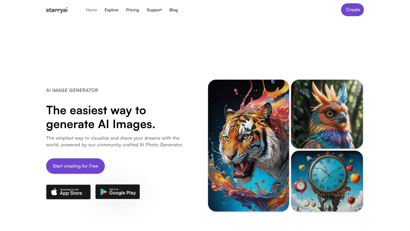
Once the visual notes are clear, you can use them as steering information rather than hoping an uploaded image will carry the entire concept. starryai lets you work from selfies, text prompts, and emojis, while its image-guidance workflow combines an uploaded image with written direction. That makes it suitable for testing a reference's mood, pose, palette, or transformation without treating the source image as a complete instruction set.
Upload the reference or a related base image, then begin with the subject and composition. A practical first prompt might describe a three-quarter portrait of a woman seated at a wooden desk, leaning toward a sketchbook, subject placed on the right third of the frame. Add only the lighting and palette that define the reference.
The first generation is diagnostic. If the pose is wrong, revise the action and camera language. If the scene feels too bright, adjust the light quality and shadow depth. If the image loses its identity, remove decorative style terms and reinforce the subject, framing, and key materials.
Creators often begin with “dreamy,” “viral,” or “cinematic,” then wonder why the output feels interchangeable. Style works better after the generator understands the scene. Add “editorial digital illustration,” “subtle paper grain,” or “soft painterly edges” after the structural description, not before it.
You can also use starryai's style transfer workflow when the target image's visual treatment matters more than its literal content. Its sketch workflow starts with an uploaded photo and a prompt describing the intended sketch style, which gives you another way to separate subject guidance from aesthetic direction.
Use the editing tools to correct one issue at a time. A useful sequence is:
This video offers a visual reference for moving from an idea toward a generated result:
For a simpler introduction to the interface and basic workflow, use this guide to an AI image generator for beginners. The goal isn't to force a reference into an exact duplicate. It's to preserve the visual decisions that matter while leaving room for a new image to develop its own details.
The most common failure is prompt clutter. A creator sees an intricate image, writes down every visible object, adds several style names, then appends quality terms for good measure. The generator receives too many competing priorities and produces an image that contains the ingredients but loses the original rhythm.
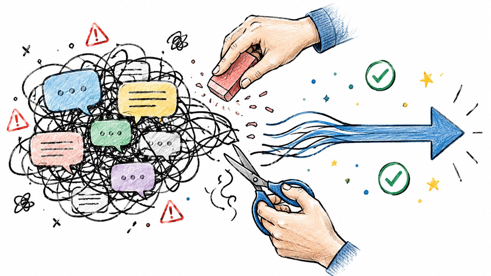
When an output feels generic, don't automatically make the prompt longer. Delete weak adjectives first. “Stunning,” “epic,” and “high quality” rarely explain what makes the reference work. Replace them with observable instructions about framing, light, lens feel, texture, and spatial relationships.
Conflicting descriptors create a similar problem. “Minimalist maximalist editorial collage” may sound creatively ambitious, but it gives the model incompatible directions. Choose the dominant visual logic, then describe supporting details that agree with it.
Compare the generated image with the reference using a fixed checklist:
Change one category per iteration. If you alter the pose, palette, lighting, and style together, you won't know which change improved the result. The ACM study on prompt optimization found that 100 to 500 optimization iterations can be sufficient for fast iteration, and that iteration count and optimization length didn't significantly correlate with user satisfaction. More testing isn't automatically better. Focused testing is.
Legal assumptions can also create trouble when you reverse-engineer a reference for commercial work. A prompt isn't a magic ownership document, and purely AI-generated output is generally not copyrightable in the United States without meaningful human authorship. Human editing, compositing, or arrangement may be protectable, so review the copyright guidance on AI-generated work before using a recreated visual commercially.
The reliable workflow is simple: observe, prioritize, generate, compare, and edit. Automation can propose language, but deliberate human analysis decides what deserves to stay.
starryai gives you a practical place to combine an uploaded image with a carefully extracted text prompt, then explore styles, transformations, and edits without rebuilding the visual from scratch. Visit starryai with one reference image, write down its subject, light, composition, and palette, and test a focused prompt instead of a crowded one.


.svg)