


Written by Mo Kahn on


The most popular advice on realistic skin is also the most reliable way to ruin it. Adding ultra-detailed, hyper-detailed pores, and 8k skin to every prompt doesn't make a face believable. It makes distant figures look carved, close-ups look etched, and young faces look decades older than you asked for.
I would start from the opposite rule. Ask only for the detail a camera at your intended distance would record, then protect tonal variation, uneven shine, and small, local relief. That's what viewers read as living skin, and it's what survives across different tones, ages, and styles.
Realistic skin texture isn't a pore count. It's a layered surface where the amount of visible detail matches how large the face appears in the frame. Too little relief gives you smooth, waxy skin. Too much makes pores and facial hair look etched, even when the face shape is right.
Aim for three layers working together:
Skin also changes by body site. A 2017 optical coherence tomography atlas in PMC extracted 63 optical, first-order statistical, and textural features from 17,000 healthy-skin images across 10 body sites, showing appearance can't be reduced to one smoothness value. Eyelids, cheeks, and palms differ in structure and in how light attenuates and scatters.
Say a portrait looks synthetic because a generic pore pattern covers the forehead, cheeks, and chin at the same strength. Remove that pattern, keep uneven tone and soft redness, and it often reads as more real immediately. If you're comparing digital texture with real skin care, ProMD Health Bel Air skin tips are a useful reminder that real texture is uneven in ordinary light.
Would this skin look right at the same size in a real photograph?
Use that question for every generation. If you couldn't see that pore from that distance with a camera, don't ask for it.
Texture scale should match how large the skin appears in the frame. That's the whole decision. The closer the camera, the more pore-level detail a viewer can plausibly see. The farther away it is, the more texture becomes tone, shadow, and sheen rather than individual features.
| Shot type | Texture scale | Include | Hold back |
|---|---|---|---|
| Beauty close-up, face fills the frame | Fine, pores, peach fuzz, subtle tone shifts | Pore clusters on nose and cheeks, faint freckles | Repeating pore grid, etched hairs |
| Editorial head and shoulders | Medium, softer pores, fine lines | Light lines around eyes, uneven redness, sheen on forehead | Heavy scar or pore detail unless requested |
| Full-body or distant character | Coarse, texture reads as tone and shadow | Soft tonal variation, skin folds on hands | Individual pores, which cannot be read at distance |
| Stylized avatar or book cover | Low, painterly smoothing with tonal variation | Gentle colour shifts, simple shading | Photoreal pores, which clash with the style |
| Phone selfie or social post | Medium-fine, lower contrast | Natural shine, slight grain | Heavy retouch, uniform glow |
A phrase like ultra-detailed skin overshoots on a full-body character. You're asking the model to invent detail the viewer can't verify, so it often compensates with high contrast speckle on the face, hands, or arms. On a beauty close-up, the same vague phrase can undershoot because it doesn't say where pores cluster, where shine sits, or how tone changes.
Specificity beats intensity. For a close-up, say pores clustered on the nose and inner cheeks, finer texture on the forehead, faint freckles. For head and shoulders, say soft pore definition, light lines around the eyes, uneven redness. For a distant figure, don't mention pores at all. Ask for soft tonal variation and let clothing, pose, and shadow carry realism.
Evaluation backs up that caution about smoothness. In a monocular facial-appearance benchmark on arXiv, a joint inverse-rendering method achieved PSNR 38.09, MAE 1.18, SSIM 0.97, and LPIPS 0.10, while dermatologist evaluation rated real images highly for skin texture 22.4% of the time versus 13.4% for synthetic images, at p < 0.001. Pixel scores and sharpness alone don't guarantee skin a human expert accepts, and the named failure modes include uniform pore scale and waxy roughness.
Pick the row closest to your frame before you touch anything else. Changing style, lighting, or age on top of the wrong scale just gives you a better-lit version of the same mistake.
Practical rule: If the face is smaller than your thumbnail on screen, prompt for tone. If it fills the screen, prompt for placement.
Build the prompt in order, from identity to surface. If you start with texture, the model has to guess the age, tone, and distance that texture belongs to. Those guesses are where waxy or etched skin begins.
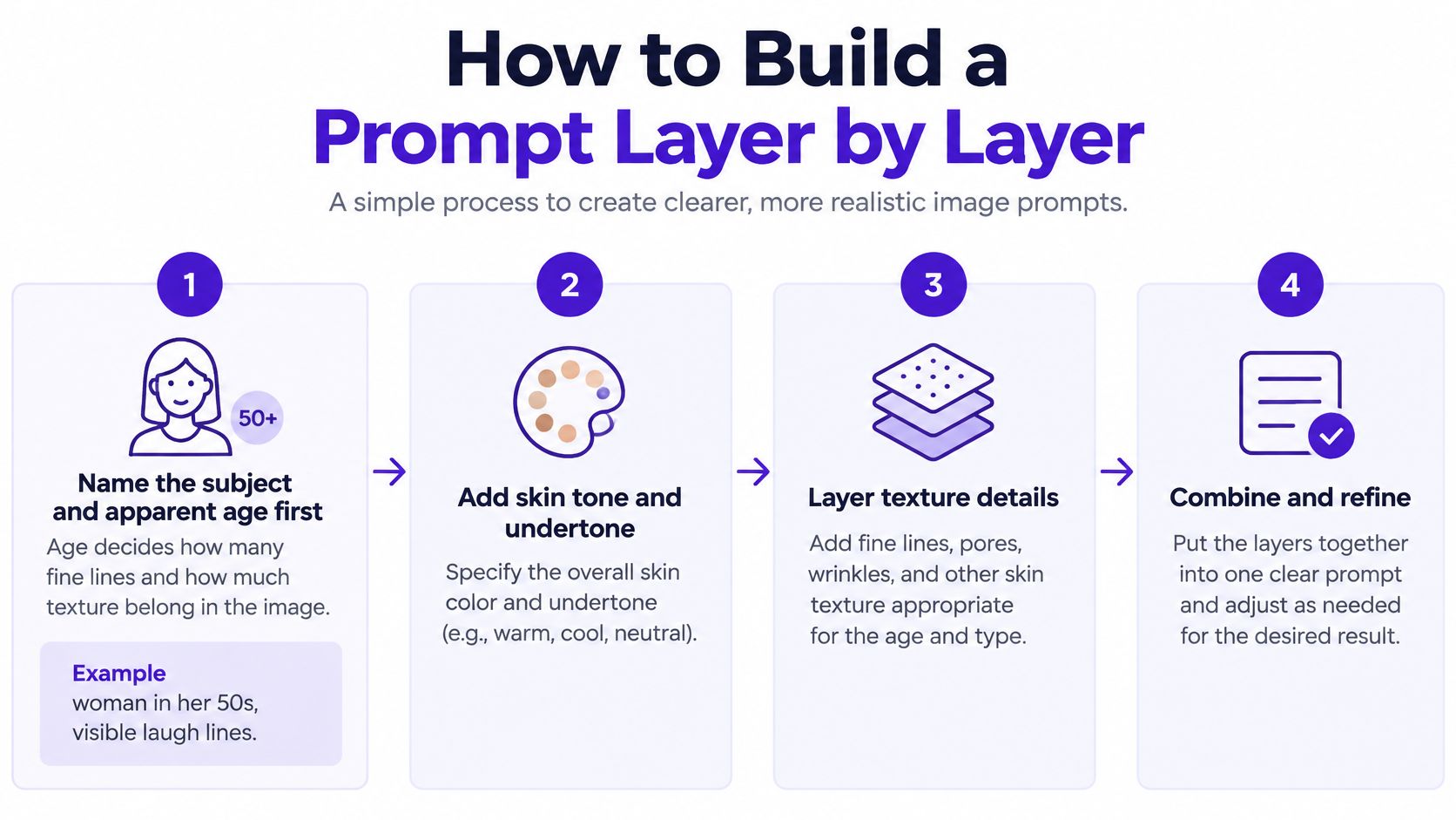
Name the subject and apparent age first. Age decides how many fine lines belong in the image, so write woman in her 50s, visible laugh lines instead of just woman. A young adult with deep forehead lines will look wrong no matter how good the pores are.
Add skin tone and undertone in plain words. Write deep brown skin with warm undertone or pale skin with cool undertone, not natural skin. Plain language gives pigment and redness somewhere specific to go.
State the shot type and its scale. Choose the matching row from your framing, such as close-up, pores visible on nose and cheeks or medium shot, soft tonal variation. This stops the model applying close-up detail to a distant figure.
Add one lighting phrase. Use soft window light from the left for gentler relief, and save harsher light for deliberate close-ups. One clear direction beats stacking studio light, golden hour, flash in the same prompt.
For a fuller breakdown of ordering and wording, see this guide to AI prompt optimization. It's especially useful if your prompt works for composition but keeps losing surface detail.
Add the texture phrase last, with three or four terms. Try fine skin texture, subtle redness, faint fine lines, uneven tone. Don't stack five or six detail words. Each extra term raises contrast, and stacked terms are the fastest route to etched pores and wiry peach fuzz.
Check the result at full size before you regenerate. If the skin looks wax-smooth, remove flawless and glowing first. Those retouching words often overpower an otherwise good texture phrase.
The same layering logic helps creators outside portraits. If you're validating designs for products, AI-powered POD research with Trendlytic shows a similar principle, test the specific design brief rather than relying on generic quality claims. In both cases, concrete attributes give you something you can evaluate.
Change one term at a time. If you alter age, light, and texture together, you won't know which change helped.
I would keep a short prompt log for portraits you plan to reuse. Note the shot type, texture phrase, and the one word you removed or added. After three or four generations, you'll have a reliable recipe for that character instead of a folder of near misses.
Glossy, uniform highlights ruin texture faster than missing pores. When the forehead, nose, and both cheeks shine at the same brightness, skin looks painted on, even if the underlying detail is detailed enough. Real skin breaks highlights up. Oil, relief, and angle change from one area to the next.
The image below is a useful way to think about that breakup, as light reveals relief instead of sitting evenly on the surface.
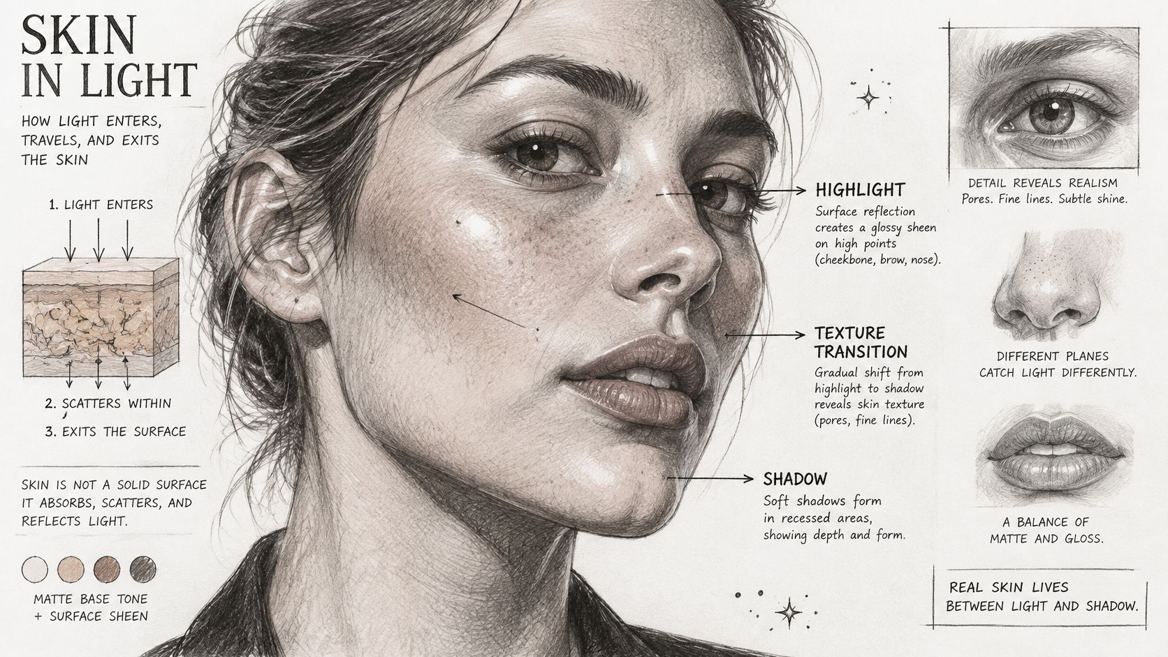
Production facial capture treats appearance as separate components. A validated facial-capture workflow in ACM Transactions on Graphics separates diffuse albedo, specular intensity, high-resolution normals or microdisplacement, and global specular roughness, while accounting for subsurface scattering. In prompt terms, that's your matte base colour, your oily sheen, your fine relief, and how sharp or soft the shine is. You need all four to vary independently.
Subsurface behaviour matters in thin areas. Light penetrates skin, diffuses through it, and exits at nearby points instead of reflecting only at the surface. Ask for warm translucence at the ear, soft glow at the nose edge, or warm colour in the cheeks rather than a general glow across the whole face.
The short video below shows how highlight placement changes perceived relief, which is worth watching before you judge a generation only by its pore detail.
Place the strongest highlight on the forehead or cheekbone, keep specular spots small, and let the jaw fall into soft shadow. Pores drawn only as dark colour spots vanish when lighting changes, while excessive relief creates crater-like, orange peel skin. Low-amplitude detail with restrained, spatially varying highlights is the safer target.
If you're troubleshooting a whole image rather than skin alone, this overview of realistic AI images helps you separate lighting problems from anatomy and texture problems. A reusable phrase is soft side light, small highlights, warm translucence at the ear.
Choose the style before you write the texture phrase. A beauty or cinematic direction pushes toward smoothing, so pair it with language that keeps uneven tone and fine lines. Use photoreal styles for close-ups, and painterly styles for avatars and covers, because photoreal pores fight against illustrated shading.
Check that the style hasn't reshaped the face or changed features your prompt specified. It's easy to chase better skin and accept a different nose, jaw, or apparent age without noticing.
Work at full size and make reversible changes. Lift local contrast slightly on the cheeks, forehead, and jaw to restore relief. Add fine grain at low strength if the surface looks plastic, and keep sharpening light, since heavy sharpening turns ordinary pores into etched pits.
Avoid heavy noise reduction and skin-smoothing filters. They remove the micro-detail you just prompted for, and they often leave hair and eyes sharp while the cheeks go soft. That mismatch is a clear synthetic tell.
Match highlights instead of adding new ones. If shine spreads evenly across the forehead, nose, and cheeks, reduce its strength or mask it, and keep sheen mainly on the forehead and cheekbone. The same restraint applies in other visual work, and this breakdown of lighting low poly cities for mattress ads is a good reminder that controlled highlights sell form better than brightness everywhere.
Compare the edit with the raw generation at the same size. Stop when a change is no longer visible at thumbnail scale, and keep the unedited file so you can roll back any step that removes texture.
Start with waxy, plastic-looking skin, because it's the most common failure and the most misdiagnosed. People usually respond by adding more detail words. I'd do the opposite first, reduce uniform shine and remove retouching language. Waxiness is often a lighting and smoothing problem, not a pore shortage.
| Symptom | Likely cause | Fix |
|---|---|---|
| Waxy, plastic-looking skin | Too little relief and uniform gloss | Add pore and fine-line variation, reduce global shine |
| Etched, crater-like pores | Over-strong or stacked detail terms | Drop one detail term, ask for softer pore definition |
| Repeating pore pattern | The same micro-pattern across the face | Ask for varied pore size and clustering |
| Airbrushed, overly even face | Retouch words such as flawless dominate | Remove them, add tone variation and natural lines |
| Flat or uniform highlights | A single bright light source | Add directional light so shadows fall into texture |
| Texture stops at the jaw | Neck and hands never described | Describe skin on neck and hands in the same prompt |
Etched pores need subtraction, not more realism language. Drop one term, such as hyper-detailed or extremely detailed, and replace it with soft pore definition. If peach fuzz looks like wire, reduce close-up language or move the framing back.
A repeating pore pattern is a placement problem. Ask for varied pore size, clustered on the nose and inner cheeks, finer on the forehead. Real pores aren't stamped at one scale across the whole face, and saying where they change gives the model a better pattern to follow.
For an airbrushed face, audit your adjectives. Words such as flawless, porcelain, perfect, and glowing instruct the model to remove the variation you're trying to keep. Remove them before you add anything, then prompt uneven tone, subtle redness, natural fine lines.
Flat highlights need direction, not brightness. Change bright studio light to soft window light from the left so one side of the nose and cheek carries shadow. Relief becomes visible because light rakes across it, not because you've increased contrast everywhere.
Texture that stops at the jaw is a framing omission. If the neck, shoulders, or hands are visible, describe their skin in the same prompt, for example fine lines on the neck, knuckle creases on the hands. A detailed face attached to smooth, untextured hands looks assembled rather than photographed.
Sort the fix before you regenerate. Waxy skin, etched pores, and airbrushing usually need one changed phrase. Repeated patterns and missing neck or hand texture may need a different shot scale or a fuller description. Don't change the model, style, age, and texture phrase in one pass, or you'll fix the symptom without learning the cause.
If the fix requires five new adjectives, it's probably the wrong fix.
Most texture advice tacitly assumes a light-skinned beauty portrait. That assumption fails in practice. A 2026 framework indexed by RePEc highlights reduced performance for Fitzpatrick skin types IV to VI, linked to under-representation, annotation bias, and inconsistent expert labeling. A prompt that looks natural on one complexion can lighten, flatten, or homogenize another.
Test with four variants using the same basic prompt structure:
For this check, a future-dated 2026 projection should be read as a warning about where validation needs to go, not as proof that every tool fails every deep skin tone. The practical point stands now. You have to look, variant by variant, instead of trusting a single default result.
Removing all texture can erase identity cues. Adding generic imperfections can become a stereotype. Neither is realism, because both replace the subject you described with a stock idea of skin.
Pair texture phrases with explicit undertone, pigmentation variation, age, and skin condition instructions. Say deep brown skin, warm undertone, uneven pigment on the cheeks, fine pores on the nose, rather than adding blemishes and hoping the model interprets it respectfully. For mature skin, name laugh lines or sun spots instead of asking for old skin.
This guide to diverse representation in AI images is useful when features, hair, and complexion start drifting toward a default face. Check whether the result still matches your prompt, not whether it matches a familiar stock portrait.
If one complexion needs far more prompt words to look natural, change the prompt structure instead of accepting an edited default. That's a signal your wording is carrying an unstated assumption. Make tone, undertone, and pigment behaviour explicit for every subject, not only for subjects the model handles poorly.
Run a short pre-publish test before you post, print, or put a portrait on a cover. Render the same face under frontal, side, and hard top light. Then inspect it at thumbnail size and at full size, because texture can pass at one scale and fail at the other.
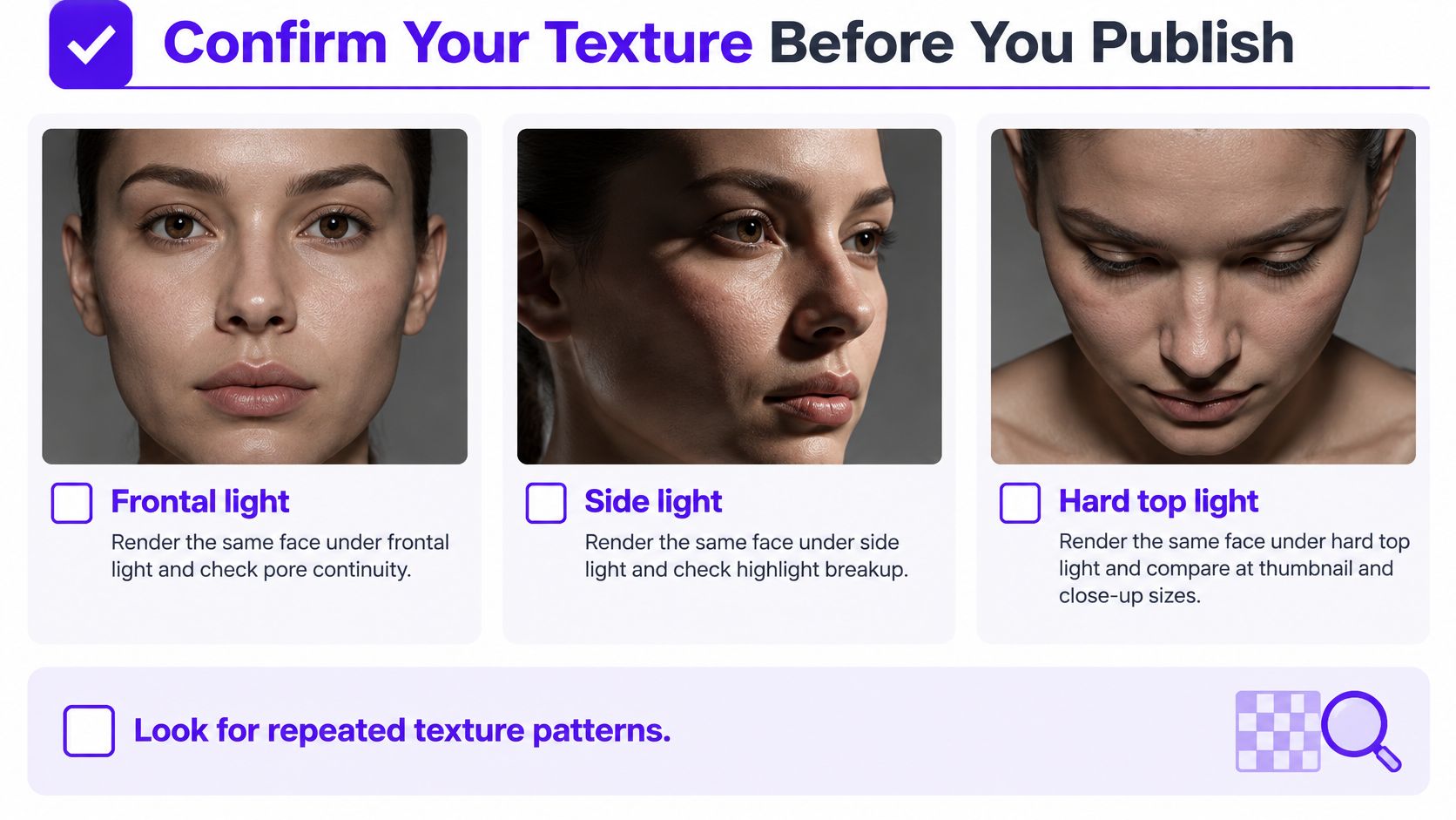
Look for repeated micro-patterns, waxy roughness, pore discontinuity, and missing colour variation under the surface. Check whether highlights break up on the nose and cheeks or slide across the face as one glossy sheet. If the skin only works under flat frontal light, it isn't ready.
Pair any image metric with a human check, since pixel similarity can reward over-smoothed faces. Show the image to two or three people without telling them how it was made. Ask them to rate texture realism, colour realism, and overall quality separately, because a sharp, attractive image can still have synthetic skin.
For the final pass, upload a photo you already have, and starryai's AI editor turns words into high-quality visuals you can compare directly with the original. Apply your shot-type scale and texture phrase, generate a few variations, and keep the one that passes the three-light check. starryai offers daily free AI images without watermarks, so you can run those comparison variants before you commit to a final portrait.
Create your next portrait in starryai by starting with the shot scale, age, tone, and lighting phrase from this guide instead of a generic detail stack. Generate a few variations, run the frontal, side, and hard top light checks, and keep the version where pores, tone, and highlights still hold together.


